Showing posts with label PENGUIN. Show all posts

Sunday, 27 March 2016

OUGD503 - Penguin Design Awards: Submission

OUGD503 - Studio Brief 1/Penguin Design Awards 

Submission


In preparation for submission I also created impact boards as these are required of shortlisted for the award. This produces a high impact statement that shows off my design and succinctly explains my concept to to the judges. These impact boards look professional, mocking up the design onto books to give an example of how the cover would work in context, the concept is succinctly highlights the design designs that informed my resolution and articulates how is successfully resolves the brief. 


OUGD503 - Penguin Design Awards: Evaluation

OUGD503 - Studio Brief 1/Penguin Design Awards 

Evaluation 


My resolution to the brief is informed by the colloquial tone of voice taken from the content and satirical personality of the author, creating an engaging cover design that stands out in a busy retail environment and is reflective of the of the issues discussed within the book. The aesthetic will engage an audience through the striking use of imagery that has polysemic interpretations. Inspired by feminist art, at first glance this imagery is ambiguous and shocking, demanding the audience to engage with the cover design taking a closer look where the image can be identified as a papaya. This then creatively implies the sexual innuendo to connote the female vagina. This concept is representative of the authors personality identified through research, listening to interviews and Vlogs and is an accurate representation of how she uses satirical metaphoric language within the book, creating a sense of continuity between the cover and content.

The aesthetic is refined using a minimal two-colour palette, the combination of pastel pink and navy blue is bold and contemporary which will appeal to the key demographic. The colour palette contrasts each other well ensuring the text and image is clearly legible within the composition, further this represents a sense of equality using pink and blue in harmony as this is often used to stereotype male and female and points and is used here as a metaphor to suggest the equality of men and women. The composition of the cover is refined and minimal to create a timeless aesthetic, the use of symmetry within the cover design works well using the titles to highlight the natural symmetry of the papaya fruit which is positioned as the central focal point contrasting well against the bold navy cover. The striped background takes inspiration from the classic penguin cover design as the brief stated it needed to feel ‘timeless and classic’ this revitalised style creates a contextual link to the heritage of penguin which will appeal the audience, revitalised in this modern form. The brief further states that the cover should also communicate that the content is ‘very entertaining and often very funny’ which is clearly articulated through the playful use of sexual innuendos and connotations within the covers imagery.

The result is a classic cover design that feels traditional and timeless yet will appeal to a contemporary audience through the use of a bold colour palette and humorous imagery that embodies the personality of the author and satirical content. This further results in an appropriate design that will stand out within a busy retail environment and equally transition seamlessly to online platforms contrasting against the white website backgrounds.


OUGD503 - Penguin Design Awards: Final Cover Design

OUGD503 - Studio Brief 1/Penguin Design Awards 

Final Cover Design

Based on the feedback from my final critique I further developed the typography to ensure it is legible at a glance, this resulted in splitting the tittle and author, increasing the point size of the title yet ensuring to still created symmetry with the 'galaxy book' endorsement and placing the authors name in the bottom left corner, this contrasted nicely against the pink background to ensure this stands out and is legible at a glance. This creates an aesthetically engaging composition that is legible and eye-catching referencing classic penguin aesthetic with an engaging focal point that highlights the satirical tone of voice of the author.


Expanding this into a full wrap around cover required little adjustment, I extended the banded concept to wrap fully around the cover and used the template from the project pack to place all the essential logos/barcodes. I adjusted the author positioning to align with the barcode and placed the body copy neatly aligned with the imagery to create a sense of further symmetry between the front and back covers allowing the wrap around transition seamlessly from front to back. Placing the text in a box added further aesthetic detailing yet remained minimal in its aesthetic to ind with the style of the front cover, this also prevented the body copy from feeling like its floating mid cover. The wrap around works effectively creating continuity from the front to back design, the minimal aesthetic is classic and timeless in its stye with a bold colour palette ensuring the design appeals to a current demographic.

OUGD503 - Penguin Design Awards: Final Critique

OUGD503 - Studio Brief 1/Penguin Design Awards 

Final Critique 

Asking students and tutors for further feedback they liked this simplified aesthetic as they felt it was more ambiguous and cleaver in terms of its sexual connotations. comments from the students included 'the aesthetic is very contemporary with the use of colour and space, I like it' another student said 'I liked the original cover although think this is better in terms of distribution because its more ambitious and will fit in well to shops'. Asking for criticisms the only feedback I received was that the text was very small in terms of the title standing out. This was further addressed by tutors that advised me to make the tittle and author text more defined within the composition so it is more legible. I agree with this feedback and will make amendments to this otherwise am happy with the feedback and feel this cover design creates a strong resolution to the brief. 


OUGD503 - Penguin Design Awards: Further Development

OUGD503 - Studio Brief 1/Penguin Design Awards 

Further Development

Through further research using my inspiration blog I came across the below image and was initially really attracted to this colour scheme. The use of pastel pink and navy blue work well together creating a strong sense of contrast that allow the colours to complement each other particulate well and ensure the text is legible against the blue background. This colour scheme would work well with the context of the book as they are very stereotyped colours within children's marketing however using them together could represent how feminism is an inclusive subject that isn't aimed only at women and also the colours work well together representing the equality of males and females which is the main goal of feminism as a social movement.  


Still unfulfilled by the compositions I took inspiration from the classic penguin covers, I liked the use of the band creating high contrast between the colurscheme and created a sense of consistency within the series. Taking inspiration from this iconic cover design will reference back too these classic covers appealing to the judges and audience, it also provides a strong composition that makes the cover design eye-catching and aesthetically pleasing. 


My interpretation of this used a similar banded design to reference these classic penguin covers yet felt a lot more contemporary with the use of the contrasting pink and blue creating an eye-catching two colour colour-scheme. The large blocked band of blue immediately catches the eye which is then drawn into the social point of the papaya, this works well against the blue background creating an ambitious first impression that will require the audience to engage with the cover, having a closer look. This new aesthetic using the printed fruit works effectively to create more subtle connotations as the image is reflective of both fruit and the female anatomy. The symmetrical text works with the banded design and natural symmetry of the papaya creating a sense of consistency within the individual elements of the composition.  


OUGD503 - Penguin Design Awards: Printing

OUGD503 - Studio Brief 1/Penguin Design Awards 

Printing

Taking on board feedback from tutors regarding how the design may benefit from being reduced down and simplified in terms of the aesthetic to make the connotations less obvious and create a more subverted sexual innuendo I started to consider ways in which I could keep the bold imagery yet simplify the overall aesthetic. I found that using the edited photography created a naturally detailed image highlighting all the half tones/shading and detailing of the fruit. To flatten this image in a sense I used paint to cover the fruit and printed this onto paper, which created a far more refined outline in a single colour. This method was effective in refining the original image creating a bold single colour image, this process added a tactile nature to the aesthetic with the print leaving wrinkles and organic marks from the fruit that well represented wrinkles and a skin like consistency further relating it back to the desired connotations. To ensure this new aesthetic worked well with the other digital elements within the cover such as the typography and printing process I vectorised the printed image to make it easier to work with and digitally manipulate. 


Saturday, 26 March 2016

OUGD503 - Penguin Design Awards: Feedback

OUGD503 - Studio Brief 1/Penguin Design Awards 

Feedback


During a scheduled critique was the first time I was able to present a physical resolution to a group. The initial reaction to the design was very positive with a number of students laughing and smiling which instantly told me I had succeeded in creating a high impact design that accurately reflects the colloquial tone of voice of the author. Comments regarding this aesthetic included 'brilliant, I love the photoshop effects to make it look real' 'I didn't realise it was a fruit for a good 5 minutes' and 'Its kind of uncomfortable to look at for a long period of time (pardon the pun)'. When asked about the typography that I was initially struggling to place they group responded saying they liked the actual arrangement but felt the colour needed to be bolder suggesting whites and a similar neon pink for the title. Further suggestions included moving the 'galaxy book awards' to the top and moving one of the reviews over to fit on one line. These suggestions will help me to further develop the cover and bring more attention to the type without distracting too much from the main focal point. 

I asked tutors for further feedback and received mixed opinions, one tutor over the bold aesthetic and garish neon-colourpalette however another said it was bit too obvious and suggested for the satirical innuendo nature of the image it might be nice to make it really simple and keep the audience guessing as currently it looks very similar to a vagina whereas a more subtle approach could further engage the audience to engage with the cover and think about its connotations. I liked this theory however was initially unsure how to simplify the aesthetic to succeed in creating this desired effect. I decided to develop this as a separate aesthetic to see where this development leads, the main benefit of this would be to ensure it is suitable for all retail environments which is a key aspect of the brief as some audiences may find this too invasive and wouldn't want to be seen sitting reading the book in public with such a graphic cover. 

OUGD503 - Penguin Design Awards: Design Development

OUGD503 - Studio Brief 1/Penguin Design Awards 

Design Development

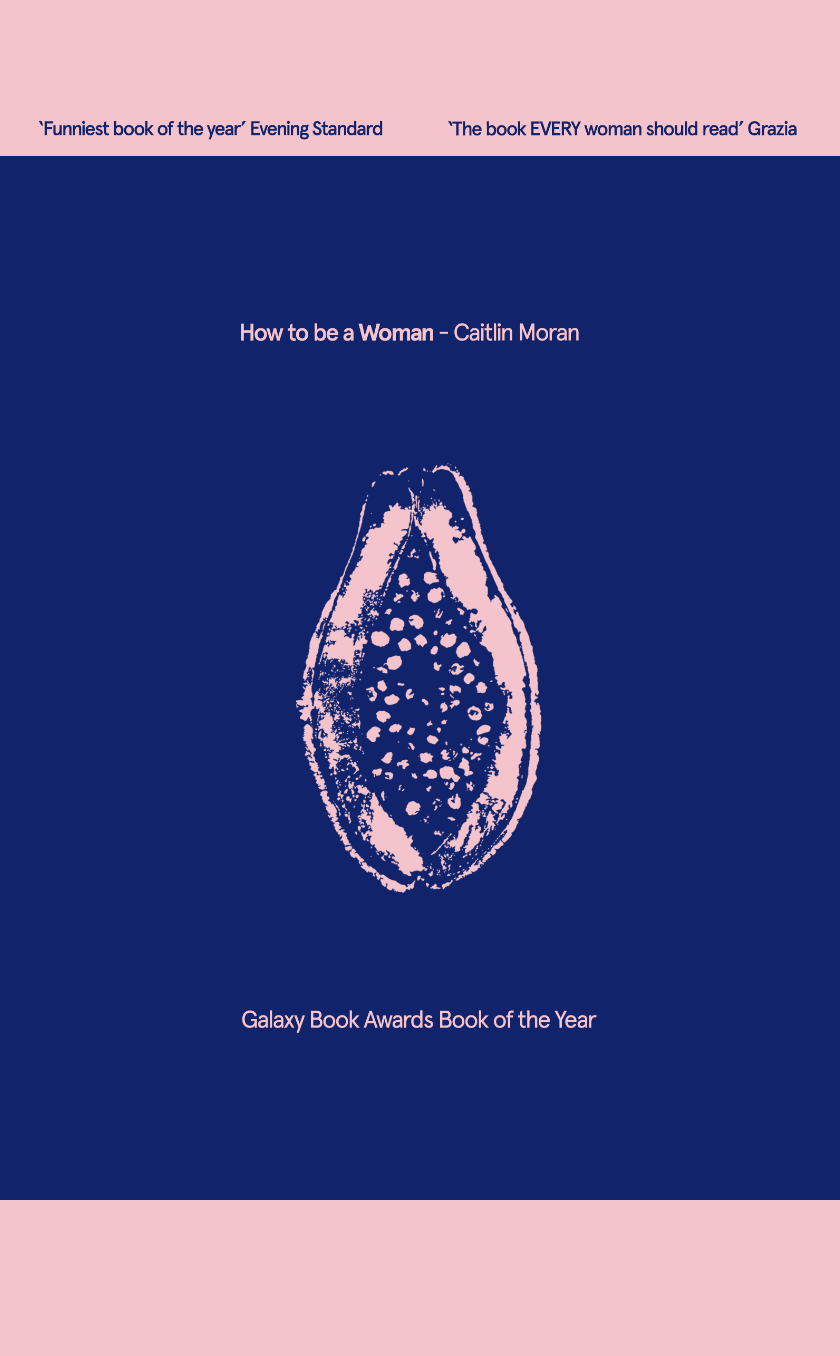
The first component of development was sourcing the fruit which was surprisingly easy in a large city such as Leeds, I was eager to get to work on the development to set up a makeshift photography studio at home using a DSLR and gorilla pod to shoot a direct aerial shot of the fruit. I was impressed with the results of this, the photography was a nice symmetrical image and the fruit already started to resemble the vagina before any post production editing. 


My first attempt of development was unsuccessful in crating an engaging aesthetic, the yellow blends the papaya into the background but the orange flesh makes this stand out too harshly against the rest of the composition. The type is legible however fills too much of the cover removing the elements of white space, the overlaying text makes it hard to identify a single focal point within the composition and results in a busy aesthetic where the eye doesn't quite know where to look first. I wasn't satisfied with the design direction, concluding further development was needed around the fruit before text can be added. 


This development took me back to photoshop for further post production editing. I established there were too many individual colours within the original photography of the papaya, to reduce this I removed the the edge of the image into to allow the fruit to blend more naturally into the background. From this I then created various colour overlays using peach as a starting point as it would further connote the female form. This aesthetic is really effective in making the audience double take as from a distance the image genuinely looks like a vagina, this is accentuated through the gradient background that further suggests open legs,  only upon closer inspection can the image be identified as a fruit. The final post production editing works well as I have retained the detail within the photography such as the excess water on the fruit further adding to sexual connotations and making the image appear more life like. 


Taking a break from the design coming back to the project I realised some commercial considerations of the colour palette. Using peach for the design is too similar to a white skin tone which isn't representative of all women and could create racial backlash regarding the design from women of other ethnicities. Addressing this issue I changed the colour palette to neon pink, although still pink this extreme saturation makes the image unrealistic or unrepresentative of any one ethnicity creating a more ethically neutral statement. The neon colour-palette gives explicit connotations similar to the red light districts, which pokes further comical and satirical statements that these issues are not usually addressed in mass media. The neon colour palette is bold and eye-catching which will ensure it stands out against a busy book shelf in a crowded retail environment. 


I had real difficulty with the placement of the text within the composition. The central image needed to be the stark focal point of the cover for the concept to be most effective, however the information still needed to be clearly legible and available for the user to see at a glance. Further development resulted in this composition which is fairly modular with the typographic elements aligning with the image to create a sense of balance and order within it's composition. This arrangement works well however I will ask specifically for feedback regarding these issues in upcoming critiques and feedback sessions to inform further design development.

OUGD503 - Penguin Design Awards: Concept Development

OUGD503 - Studio Brief 1/Penguin Design Awards 

Concept Development

Analysing my initial sketches I concluded that the strongest concept was the design that articulated the satirical tone of voice of the book and the personality of the author. This concept works well to engage an audience giving then an initial shock factor when seeing the cover from afar, this will make them double take and engage with the cover to look closer before realising that it is fruit. This then creates a bold playful statement that is appropriate to display in a public environment with no offensive imagery being used, its all in the connotations from the audience. This effectively highlights the sarcastic and playful language used within the book and creates a bold statement that will work well to ensure the book stands out against a busy retail environment. 


Developing the concept further I looked at alternative fruits that resembled vaginas however through feedback from other design students found the papaya was the most effective image in displaying a clear message, comments included 'the papaya is the most noticeable one, some of the others like the kiwi looks too vague' and 'the papaya is also tropical and exotic so will engage an audience from that perspective as it is fairly unusual to see in Britain.


FEEDBACK

Before beginning more detailed development it was important to receive feedback from students and tutors based on the concept of my design direction. Tutors liked the informed nature of the concept reinforcing the colloquial and playful tone of voice within the aesthetic to create a sense of continuity between the cover and content. Students felt the design was bold in its nature using fruit to represent the vagina but felt the concept was engaging laughing at the idea with comments including 'I can't wait to see how it looks' and others simply laughing at the humour nature of the design direction. From this feedback I can start to develop a more distilled aesthetic for the concept which can later be refined into the most appropriate resolution. 

OUGD503 - Penguin Design Awards: Initial Sketches

OUGD503 - Studio Brief 1/Penguin Design Awards 

Initial sketches

From my research into the book,author, audience I was confident in creating a range of initial sketches that would articulate my first design directions would could then be evaluated  and developed accordingly. I took inspiration from the feminist art developed in my research when designing using the iconography in metaphor ways to create stronger statements within the connotations of the pieces. The first concept is based on the most basic of iconography, using the female toilet symbol as the largest generalisation of women possible. This holistically represents the title of the book while pointing a satirical gesture at how this image is painfully far from representing the woman is the individual. 


Inspired by the bold nature of the feminist art I used this design to highlight one of the most popular feminist issues of double standards when it comes too nipples. This sense of double standards that its inappropriate for women to show their nipples however its perfectly fine for men is a strange concept that feels outdated in the 21st century yet is still an issue within society. The high quality photography zoomed into to the focal point of the nipple will create a strong and eye-catching aesthetic. When analysing this I concluded it may be inappropriate to display in book shops and I would have trouble taking original imagery.  


Adopting the satirical tone of voice of the book and Moran's personality I came up with a conceptual design strategy to use fruit representative of the vagina to create a bold playful statement that is eye-catching yet would not be inappropriate to display publicly. This Embodies the authors personality and books tone of voice in a playful engaging aesthetic that will make the audience double take and want to look closer at the cover making them interact with the design and be more likely to remember the title creating a talking point around its aesthetic. 


Another key issue within the book is body image and beauty standards/conventions. This cover concept uses a similar satirical style within its aesthetic using a faceless silhouette surrounded by different emojis to represent how women are expected to chop and change their apparence to match current 'trends' this could also hint at darker connotations of digital manipulation within advertising which presents unrealistic body standards for women. Evaluating this design it was clear I would have to develop the aesthetic further as it currently feels similarly claustrophobic to the current cover design. 


Continuing with this theme highlighted in the above design this design uses a mannequin to represent how women are posed and shaped by society into what it deems to be a 'woman'. This sense of moulding women leaves no room for individuality and suggests they are puppets controlled by society, this offers a deep contextual insight into the social place of women which is satirically talked about through the content of the book. 


Friday, 25 March 2016

OUGD503 - Penguin Design Awards: Feminist Art

OUGD503 - Studio Brief 1/Penguin Design Awards 

Feminist Art 

I thought the content of the book could be used as inspiration for my redesign of the cover. I started my researching feminist art as this aesthetic could appeal to the target audience and better reflect the books content as opposed to only reflecting the author as the current cover seems to display. I found this specific variety of art tended be very bold, explicit and have angry connotations. The first image I looked at was explicit in terms of its aesthetic, This piece looks at the concept of free the nipple and how we perceive double standards between males and females chests. The writing in the body adds a personal connotations through the used of hand rendered type to create an emotive connection with its audience. 


The second image draws on stereotypes, using the archaic hobby of needlepoint (stereotyped as a female activity) the over use of pink creates garish connotations of women further extended through the use of delicate scissors and floral patterns. This is then juxtaposed with the stitched type 'smash the patriarchy' this contrasts the overall aesthetic in terms of concept which the piece making a statement to reverse the stereotypes its connoting in terms of its visual aesthetic. I like this satirical style on contradicting itself and find it works well making the audience actively question the image. 


The final image I analysed is a famous piece by Barbra Kruger who overlays short political statements over imagery to articulate her views on people/society. This image is a take on theory from French philosopher René Descartes famous quote "Cogito ergo sum"....."I think therefore I am" basically meaning you exist simply because you made a conscious effort to think. Kruger takes that sentence to a materialistic level - in other words, a person is defined not by what they think, but what they own (through shopping) this is a trate commonly associated with women. To me this piece is very conceptual in the way in which it targets the image of women and is effective in questioning our perceptions of society. 


These images target issues of women in different ways however are all effect in communicating their concepts to the audience. I will take inspiration from the different aesthetics and ways in which the pieces communicate forward into my initial ideas and design development to successfully target the target audience and create an engaging yet contextual resolution to the brief.

Thursday, 24 March 2016

OUGD503 - Penguin Design Awards: Book Cover Analysis

OUGD503 - Studio Brief 1/Penguin Design Awards 

Book Cover Analysis

The existing cover for Caitlin Moran’s ‘How To Be A Woman’ lacks a certain engagement from an aesthetic perspective. There is little white space within the composition which creates an almost claustrophobic feel with the large text elements being tightly packed together. The oversized titles reinforce this claustrophobic feel with the ‘How to be a woman’ typeface contrasting the rest of the body copy in a display script that one can only assume is supposed to represent nature with the natural curves which could be a subtle reference towards ‘the lady garden’ as this is one of the active topics within the book.

Although the book is partly based on Moran’s own experiences and part social commentary I feel the cover design focuses too much on the author as an individual. This could have been an initial marketing tool to use her status as a popular and successful journalist to promote and sell the book, however the issues discussed transcend individual perceptions and beliefs are common amongst all women therefore using the author as the focal point within the cover design is unnecessary and slightly contradicting to the books ethos. This is further reinforce through the name placement of the author taking up the whole first third of the cover and will be the first thing seen when stacked on a busy bookshelf. This further reinforces the notion that the aesthetic is based on Moran’s status as a controversial journalist to sell the book as opposed to its content.


The Colour scheme is very dark as a whole, the feature foiling brings out the title and author on a physical copy however digitally this is not effective and presents a flattened image that is far less engaging. The green background is gradiented to draw the eye to the image of the author leaving a dark dull colour at the top of the book which will not appeal to the target audience as it isn’t bold or eye-catching at a glace. Overall I feel the book cover design could benefit from bold engaging imagery that focuses on the contents topics more holistically than the author, this can be brought to life through a bolder colour-scheme with a more effective composition to free up white space in order for the design to become more aesthetically pleasing and more effectively target its key demographic.