Poster Design
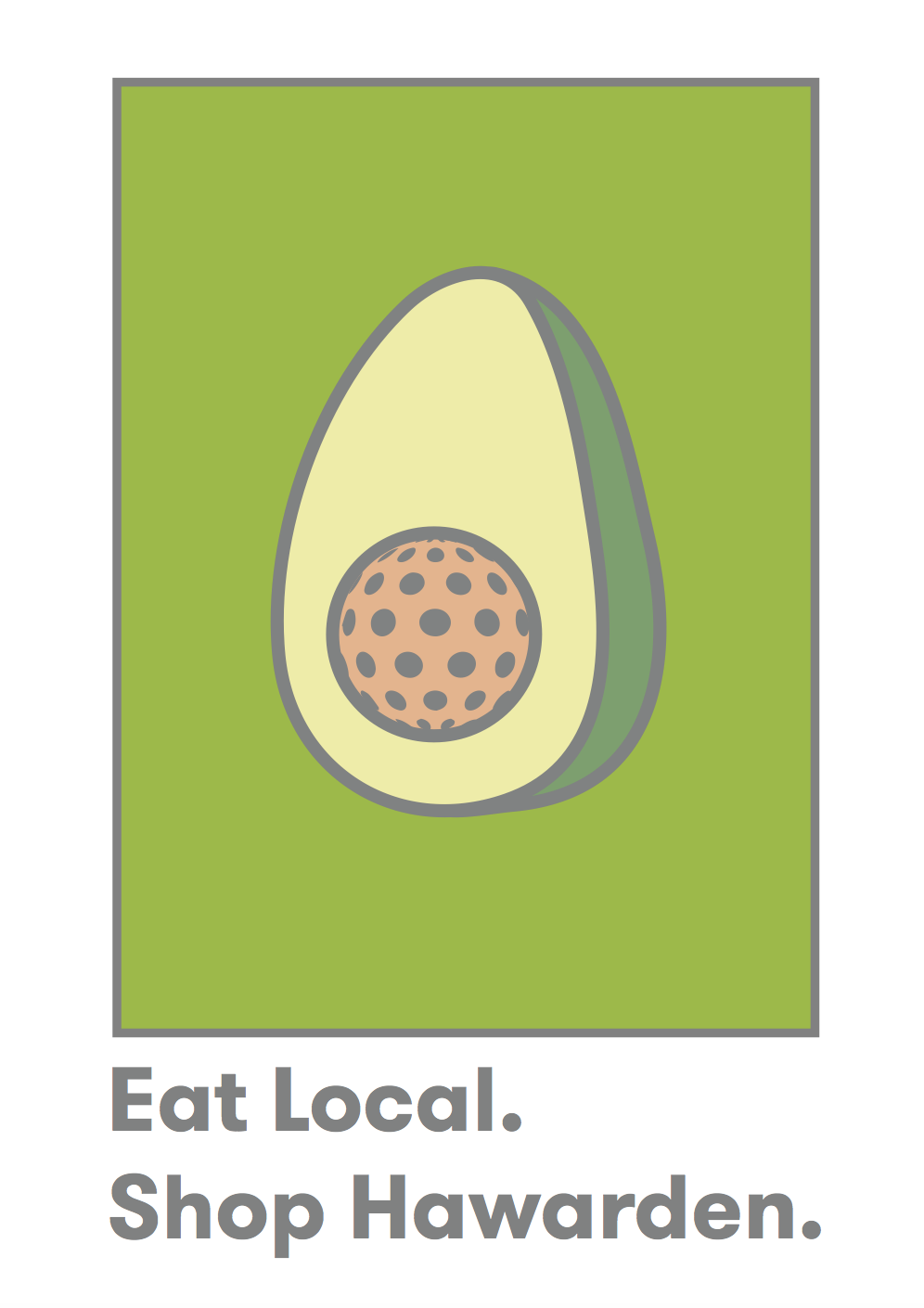
With a visual style developed through the development of illustrations and an effective campaign logo the next stage of development was to create an effective poster series to promote the campaign as the primary visual stimuli to connect the target audience with the campaign and by extension the Hawarden Estate. Keeping with the theme of keeping the aesthetic simple to fully promote the quality of the produce over other encouraging factors such as price as used my most mass super markets.
These initial poster designs keep to a similar aesthetic originally praised by tutors and students when developing the initial campaign aesthetic. The bold use of imagery creates a significantly engaging focal point that instantly creates conversation around food. Presented with a boarder style to flow seamlessly into the campaign logo which acts as a tag line instantly making the viewer question the source of their food, the type 'eat local' questions this concept of where food comes from followed by 'shop Hawarden' which opens the discussion regarding the viability of local produce within the community. This creates a clear and focused message that represents the aim of my campaign and uses the bold engaging aesthetic to appropriate engage the target audience.


No comments:
Post a Comment