Research: Existing Campaigns
Analysing a range of different food campaigns will give me a good understanding of how other corporations and institutions have used visual communication to engage the target audience, which for most will be very similar to my own TA. These campaigns will hopefully provide me with inspiration as to how to make an effectively engaging resolution for my client.
Intermarche
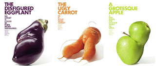
Intermarché – a big supermarket chain in France – decided it was time to save an endangered species from the rubbish bin; ugly duckling fruit and veg. In the UK a whopping 40% of greens don’t reach our shelves simply for being a bit unfortunate looking and globally we waste $750 billion worth of food each year. Patrice de Villiers took beautiful, glowing pictures of the fruit and veg for the campaign, giving them their moment to shine centre stage.
I liked the concept for this campaign as this is a largely unpublicised problem not only in the UK but globally in developed countries. I like the blunt use of photography to highlight the imperfections of veg often hidden away within the mainstream media. I like the continuity between the colour of the photography and the text however the white background and strong sans-serif typeface almost make the posters seem clinical and corporate which is the ideology the concept is trying to remove itself from therefore the aesthetic slightly contradicts the message.
Food Standards Association
Christmas is a time of particular risk when it comes to food. People cater for more than usual, cook bigger birds than they're used to and are likely to end up with leftover food to store.FSA required five eye-catching, informative and shareable images to be used online on their social media channels particularly Facebook, Twitter and Pinterest. Design studio Red stone responded to the brief with a resolution that humorously informed people of the very real issue they face
I like the use of illustration within the infographic making them strongly engaging at a glance yet informative with the supporting text which will engage an audience easily however for social media images personally find these image alittle too busy as for scrollable content I would suggest a clearer singular focal point with a minimal 3 colour palette max and slightly less text, however when reading these infographics the text and images are appropriate and engaging to the target audience.
Calgary Farmers Market
These very well executed ads for Calgary Farmer’s Market are quirky and playful with a strong concept. The campaign was designed as a compliment to the ‘Open all winter’ series designed by Wax partnership that was introduced to inform the public the farm shop is open all winter selling seasonally fresh produce, this was later extended to a summer series extension to place the farmers market in close association with fresh produce.
The final campaign analysed was the most relatable to my target audience and research focus being an independent farmers market similar to the hawarden estate farm shop. I really liked the engaging colloquial concept of the poster series, using the produce as the focal point, the detailed cuttings almost gave the photography an illustrative quality that suited the concept nicely. There is strong continuity between the two poster series which works seamlessly together with the strong concept to promote the local produce avaialbe within the farmers market.
These campaigns have given me inspiration for potential design directions and practical resolutions, the most important element taken from these campaigns is there needs to be a strong concept to underpin the aesthetics and message within the resolution as with a strong simple concept it will be naturally developed into a strong and appropriate resolution.


No comments:
Post a Comment