Showing posts with label COVER. Show all posts

Thursday, 12 November 2015

OUGD504 - Brief 3 - Development: Cover [2]

OUGD504: Brief 3: Type In Context

Development: Cover [2]

FEEDBACK:


With a number on concepts developed for the cover of my publication I approached a range of students and tutors for feedback as to which concept they felt should be developed into a final cover design. The sample of students questioned all agreed the orange was bold and engaging, they loved the info decision making and felt it made the cover stand out. The students also agreed that the first concept (1) was not appropriate and wouldn't be engaging enough to attract an audience. 

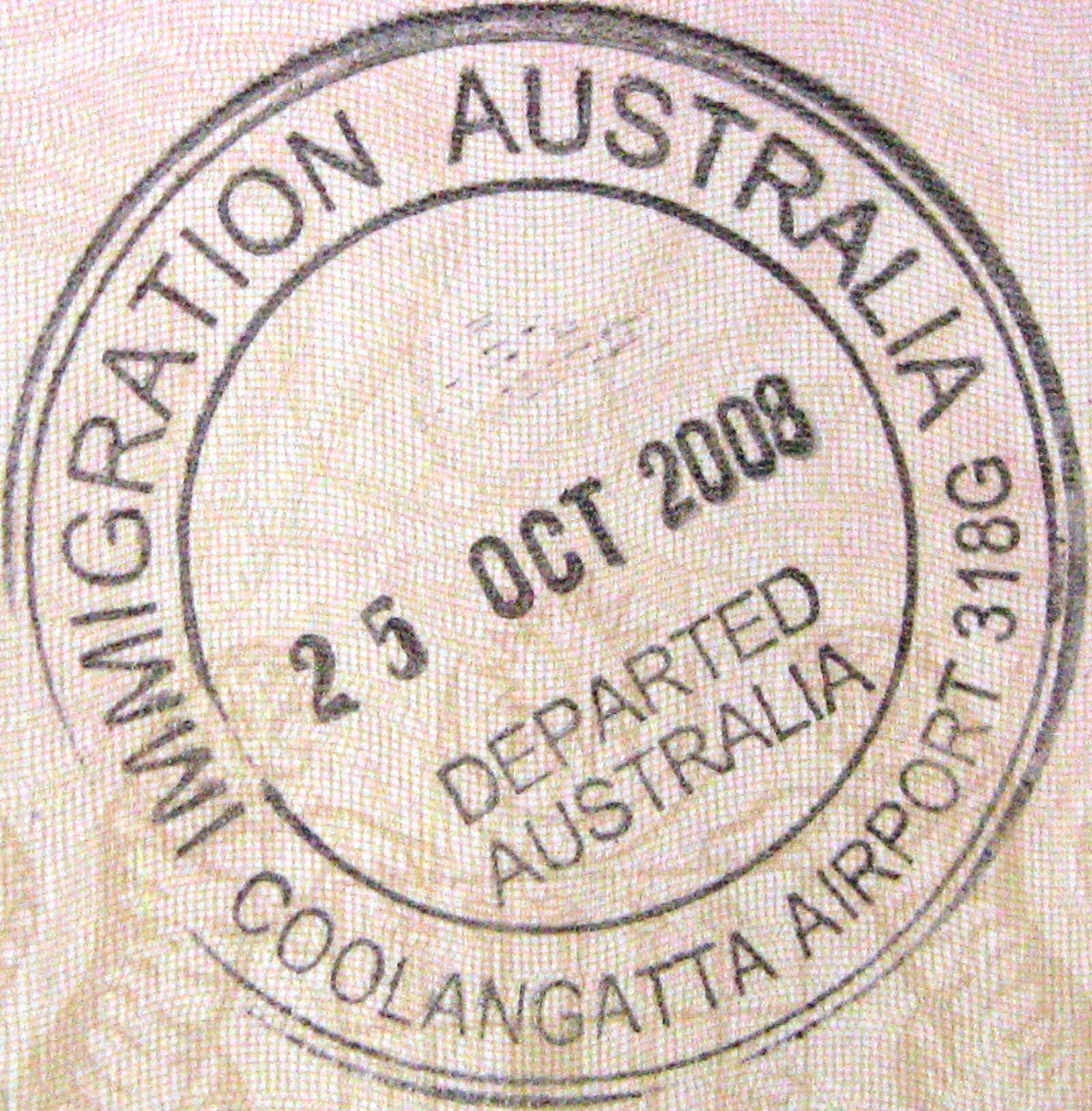
There were positive comments towards the second concept (2) students said 'I really like the concept behind this and how you've made it contemrpary because I think actual stamps wouldn't have looked as good' another student said it looked 'very tumblr' which I didn't know whether to take as a positive or negative comment although with the target audience using tumblr as a form of social media demonstrates how it would appeal to them, 

Finally the third concept was praised for its creative and innovative features, students and tutors both liked the creativity of the two covers and the cut out creating more depth than a standard book cover. Comments included 'I really like the cut out illustration as it is intriguing  and playful similarly to the inside of the book'. Tutor comments included; ' I like the second design however I think this concept makes you think of Australia more and its just more playful' students said how this would appeal to the specialist target audience through the use of creative techniques and ultimately decided that this would be the most successful cover design in appealing to the audience. 

DEVELOPMENT: 


Deciding on a chosen concept to develop into a finalised cover design I started to experiment further with this concept, I created a prototype using standard card purchased from the college shop and laser cut the illustration into the black cover recognising that in commercial printing this would be die cut however the university does not have these facilities available to me. I acknowledged the limitations of the laser cutter as thick stock results in scorch marks however is far more time efficient than manual paper cutting and creates a far higher degree of accuracy. 

With a laser cut mock up complete I started to experiment with the positioning of the smaller cover, I initially imagined it centrally placed with equal space along the 3 exposed sides however through development with tutors and students found an offset positioning would be more effective in creating an engaging aesthetic that looks more creative and will appeal to the target audience. The offset design creates a more visually interesting aesthetic that will stand out in a crowded book store and is less conventional than a standard centre aligned publication. 

Still awaiting the arrival of the stock samples from GF Smith that I plan to produce my cover using, this development has given practise to the production of the cover so that it can be reproduced easily as a final resolution on the final stock. The use of mock ups was important as it would allow me to trial the design before producing it using expensive stock that I had a limited supply of. 

Wednesday, 11 November 2015

OUGD504 - Brief 3 - Development: Cover

OUGD504: Brief 3: Type In Context

Development: Cover

With my spreads finalised I started to begin with the cover design for my publication. This needed to be bold and engaging yet representative of the content. I found from a number of the books analysed in village as part of my research that books often use photography however as my publication is centred around letterforms it is more appropriate to have a typographic cover as this is more representative of the content will form an instantly legible cover design. Choosing a bold orange for the cover was informed by earlier development and initially inspired from an image taken from the aeroplane flying over Australia source 1. This is effective in creating an instantly engaging cover, the bold colour will grab the eye of an audience and draw them to the publication if sitting in a crowded book shelf. A lot of the samples from village featured natural coloured covers such as whites and creams which will ensure the orange stands out vibrantly against similar publications. 


All of the cities I visited had an affiliation with water which inspired this cover design the curved lines connote waves and are contemporary in terms of design trends thus will appeal to the target audience. The cover design is minimal and bold with the large point size clearly articulates the title and context of the publication. Although the cover is clearly legible and will catch the eye of an audience I do not feel it is that engaging in terms of its design, therefore will explore other straws that will engage an audience to want to pick up and interact with the publication. 


This design explores travel stamps and was inspired from looking through my passport at the different stamps received on my travels source 2 I liked the arrangement of text within shapes and how they were overprinted in ink. This concept plays in this overprinting the circle design of the cities featured within the book overplayed on top of the square to simulate this passport style stamping system. I kept the curved line and Australia from the first concept as I felt it worked far better in conjunction with these other elements within the page. This design is very contemporary and will appeal to the target audience. The context is strong making the design more informed and will create a strong first impression to the reader. 


Moving away slightly from a type only cover this concept creates a playful aesthetic for the cover making it more physically engaging. The concept includes a smaller separate cover with a laser cut illustration (die cut if produced commercially) to make the cover more three-dimensional. This will encourage the reader to pick the publication up and physically interact with it, which is important within book cover design. The aesthetic of the cover is fairly minimal, the small typography is secondary to the large illustration that takes up the majority of the page, the type works well in creating a subtle cover that will be required to be looked at closer to see the context of the book. The illustration creates continuity with the inside spreads and the shark represents Australia creating playful and engaging connotations.