OUGD504: Brief 2: Logo Starter
Context: Thankyou Print
To further add context to my logo I wanted to put my logo into an extended form applying it to different media demonstrating the versatility and success of my logo. I struggled decided on my second form of collateral as typical forms such as business cards, websites and t-shirts would be inappropriate for the product and target audience. From this logic I decided to create a thank you print that would be given to customers with the purchase of the product. I felt this was a very suitable context as it would appeal to the target audience creating a stronger relationship with the consumer. I wanted to further appeal to the specific target audience creating a specially designed aesthetic that connotes an arty vibe to appeal to the culture and people of portland that has an arty culture. I created the powerful statement 'nature is the best medicine' as I feel this appeals to the brands ethos and will resonate with the target audience. From this I then starting creating the artwork, I was inspired by a print received at the launch of the printed pages magazine as a limited edition thank you, the hand rendered aesthetic appealed to me creating arty connotations that I wanted to emulate in oder to appeal to my target audience.


Finally I created a small thank you message displayed on the reverse side of the print to further engage with the consumer and create a stronger brand reputation. This is an informal message thanking the customer for purchasing the product and directs them towards social media outlets to increase product awareness and for them to tag pictures in raising awareness to a larger audience which is important with the vast enhancements of social media today.
To further add context to my logo I wanted to put my logo into an extended form applying it to different media demonstrating the versatility and success of my logo. I struggled decided on my second form of collateral as typical forms such as business cards, websites and t-shirts would be inappropriate for the product and target audience. From this logic I decided to create a thank you print that would be given to customers with the purchase of the product. I felt this was a very suitable context as it would appeal to the target audience creating a stronger relationship with the consumer. I wanted to further appeal to the specific target audience creating a specially designed aesthetic that connotes an arty vibe to appeal to the culture and people of portland that has an arty culture. I created the powerful statement 'nature is the best medicine' as I feel this appeals to the brands ethos and will resonate with the target audience. From this I then starting creating the artwork, I was inspired by a print received at the launch of the printed pages magazine as a limited edition thank you, the hand rendered aesthetic appealed to me creating arty connotations that I wanted to emulate in oder to appeal to my target audience.
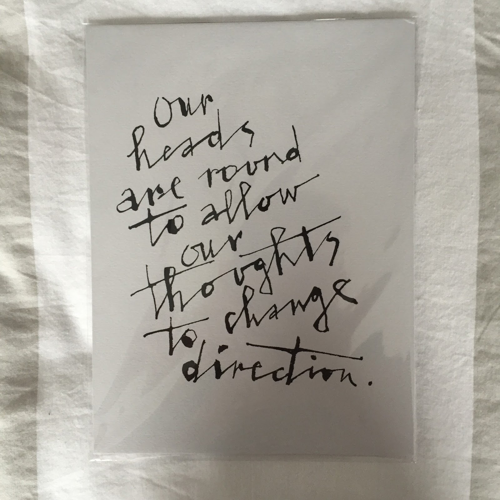

I liked the ink design taken from my inspiration and started to create some of my own designs, I used indian ink and a paintbrush to create a unique hand rendered design, this was initially more difficult than anticipated as I am not overly familiar with this medium. When I had created a range of hand rendered letterforms I scanned them into develop digitally, I vectorised the letterforms and because I developed this design digitally I was able to move reposition and interchange the letters to create the more aesthetically pleasing arrangement.


I initially trailed the design on an A6 scale as I felt postcard size would be appropriate however found this didn't work aesthetically, after further development found a square design would work more effectively with the artwork, I kept the A6 scale changing it to a square design of 105mm x 105mm as this would keep the design small and cheap to print as it is a free print and will make it easy to give to consumers. I then started experimenting further with the letterforms, I ultimately changed 'best' and the '-icine' of medicine to a script style as I felt it looked less harsh and would make the piece more engaging.


I experimented with the colour of this print, I initially felt black came off as aggressive and would stand out to the target audience, however found my primary colour used on my logo and within the brand guidelines worked extremely well creating a laid back tone of voice that draw the eye to the design without being too overpowering. This also created a great synergy with the label further creating intertextual links between the products. I trailed two sized of the artwork within the page ultimately deciding the larger design was more eye-catching and would work better in context. The logo is placed in the bottom right corner to reinforce the product and relate the print back to its brand. This will work well in promoting the product subtly if the prints are displayed on noticeboards or in public spaces.


When printing I found that the colours didn't print accurately and differed slightly from my brand guidelines and labels, I put the same colour code in and these looked the same on screen however human error must have caused one of the settings to change, I have a preparing for print workshop scheduled next week so will look to learn from this mistake but due to the short timescale of the brief cannot re-print the leaflets however will learn from this mistake to ensure it is resolved in future briefs. Overall I think this thank you print successfully puts my logo into context. It demonstrated my critical awareness to the consumer and product ethos. I think this will appeal to the target audience due to the aesthetic that is appropriate to the culture of the consumer and will further enhance the products reputation.
No comments:
Post a Comment