Studio Brief 4 - Design Processes, Communicate
Development
The first stage of my development was to find out where the olympic venues were in relation to the London underground map. To do this I printed an A3 map of the London Underground and a list of the 2012 Olympic Venues. I then cross referenced the Olympic venues with the closest tube station by placing tracing paper over the map and asking students from London to assist me with identifying where the venues are located. I found this really interesting a when I removed the tracing paper the plotted points created a cool abstract pattern however this had a genuine relevance when placed against the underground tube map.


Marbling; I wanted to create an abstract interpretation of the River Thames but was unsure about what medium to use. I asked for other students opinions on how I could use different mediums to create water effects. One student suggested marbling ink and showed me some images of work she had created using the ink, I thought it looked really abstract and innovate. I bought some blue marbling ink from a local art supplier and created my own marbling effect. I was extremely happy with the outcomes as it made fluid patters that could represent the water of the Thames. I then scanned these images in and looked for patterns within the ink that roughly reflected the twists and turns of a river. I then removed the excess pattern and adjusting the affects such as hue and saturation to create a bold abstract river that I feel works well.
The first stage of my development was to find out where the olympic venues were in relation to the London underground map. To do this I printed an A3 map of the London Underground and a list of the 2012 Olympic Venues. I then cross referenced the Olympic venues with the closest tube station by placing tracing paper over the map and asking students from London to assist me with identifying where the venues are located. I found this really interesting a when I removed the tracing paper the plotted points created a cool abstract pattern however this had a genuine relevance when placed against the underground tube map.
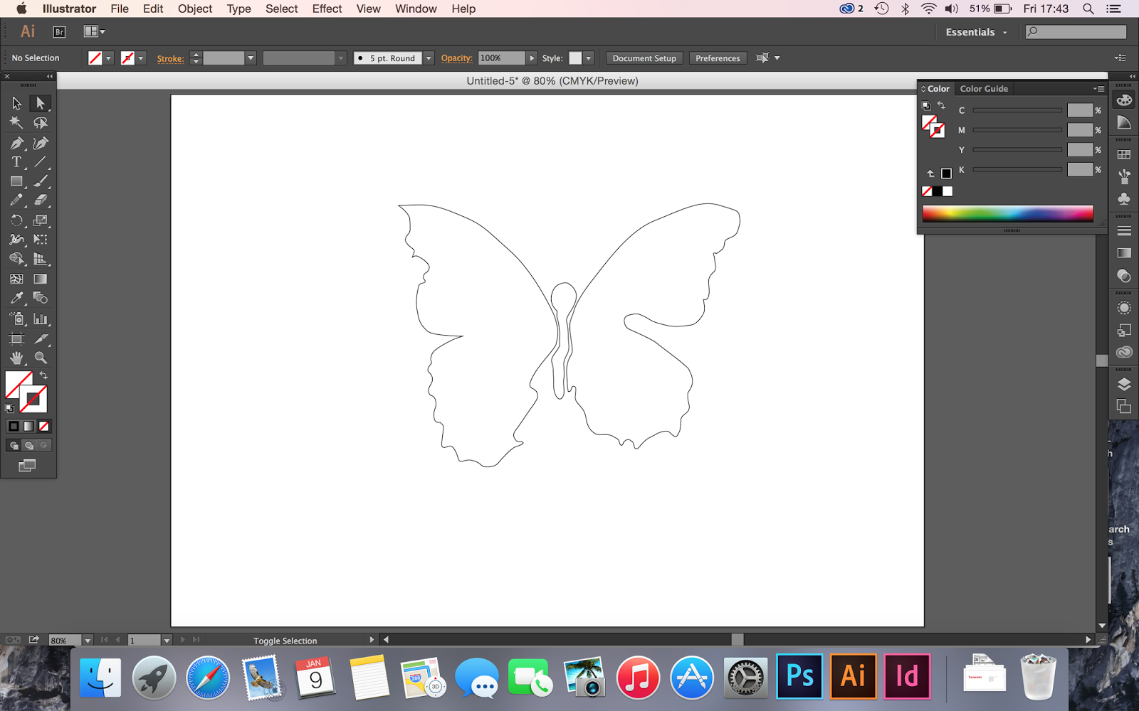
Following this I then started developing my abstract underground concept. To do this I started by identifying a range of iconic British artists and analysing their work to see if it would look appropriate in a bold, illustrative format. I decided on works from Damien Hirst, Henry Moore, Barbara Hepworth, Tracy Emin and Gary Hume. I thought I would need a range of their works to create an interesting collage so I collated 2 artworks each giving me to designs to develop and work with. I then used Illustrator to create vectors of the art, I used the pen tool creating a purposely sketched finish. I then imported these vectors into photoshop and experimented with the layout placing the art around the page. I think this worked well, I then further developed this from black symbols to off white creating a subtle contrast between the page background, I fell this prevents the page from looking too busy as this was a concern raised in the critique. I like this section of the design and think it will look effective with other layers on top creating an abstract piece of design.
 |
Marbling; I wanted to create an abstract interpretation of the River Thames but was unsure about what medium to use. I asked for other students opinions on how I could use different mediums to create water effects. One student suggested marbling ink and showed me some images of work she had created using the ink, I thought it looked really abstract and innovate. I bought some blue marbling ink from a local art supplier and created my own marbling effect. I was extremely happy with the outcomes as it made fluid patters that could represent the water of the Thames. I then scanned these images in and looked for patterns within the ink that roughly reflected the twists and turns of a river. I then removed the excess pattern and adjusting the affects such as hue and saturation to create a bold abstract river that I feel works well.


No comments:
Post a Comment