Studio Brief 3 - Design Processes, Page Layout (Indesign)
Manufacture
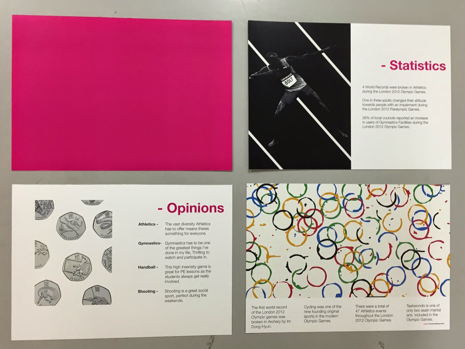
I printed my book with full bleed imagery this meant I had to print my pages on a3 paper so that I could achieve a boarder-less finish. I then had to cut the pages to size by hand. As I printed the pages from Indesign it meant I could easily add crop marks for precise cutting. I cut the pages using a metal rule and craft knife as I felt this would give the most accurate finish, as I find guillotines can often be temperamental and I needed my pages to align at perfectly to create the book.

The next stage was for me to fold each page in half so that I could slot the individual spreads inside one another to assemble the book. I used a Bone Folder to fold the pages as this replicates industry practise and allowed me to achieve a high degree of accuracy. I encountered problems while folding the pages, Due the nature of my design I had to print a range of block fill full bleed backgrounds, this looked bold and eye-catching however due to the thickness of the glossy stock and the ink, when I folded the individual spreads the ink cracked due to the stock being manipulated. The only way I could avoid this would be to print on coloured stock instead of printing the background onto white stock, However due to time restrictions I could not source coloured stock as they did not sell it at university.
I printed my book with full bleed imagery this meant I had to print my pages on a3 paper so that I could achieve a boarder-less finish. I then had to cut the pages to size by hand. As I printed the pages from Indesign it meant I could easily add crop marks for precise cutting. I cut the pages using a metal rule and craft knife as I felt this would give the most accurate finish, as I find guillotines can often be temperamental and I needed my pages to align at perfectly to create the book.

The next stage was for me to fold each page in half so that I could slot the individual spreads inside one another to assemble the book. I used a Bone Folder to fold the pages as this replicates industry practise and allowed me to achieve a high degree of accuracy. I encountered problems while folding the pages, Due the nature of my design I had to print a range of block fill full bleed backgrounds, this looked bold and eye-catching however due to the thickness of the glossy stock and the ink, when I folded the individual spreads the ink cracked due to the stock being manipulated. The only way I could avoid this would be to print on coloured stock instead of printing the background onto white stock, However due to time restrictions I could not source coloured stock as they did not sell it at university.
Overall I am happy with the physical book, I think the spreads look great on the glossy stock as they reflect a high end sporting programme. The colours are bold and luminous with the pink being especially eye-catching. The overall design is very modernist due to the use of generic conventions such as Helvetica, Tschicholds canon and a minimal colour scheme however I have personalised this with the use of the bold pink used in the London 2012 Olympic Games. If I were to produce this book again I would definitely look at printing on coloured stock to avoid the ink cracking as I am unhappy with the assembly of the outcome, however due to time restrictions and stock availability I was unable to reprint the publication. As part of the brief we were also required to submit a PDF of the final outcome, I was very impressed with the ISSUU software used as it gives the book a great online aesthetic, I am extremely pleased with the PDF outcome as it shows the book in the great quality that I intended without the errors in the physical manufacture.


No comments:
Post a Comment