Sunday 18 January 2015

OUGD405 - Module Evaluation

OUGD405 - Module Evaluation

Looking at this module in retrospect I feel I have learn a great deal. I feel this module relied more heavily on the experiemental process of how I acheived my final designs, I think I have clearly documented my methodology throught the course of this module. I feel the quality of my outcomes in this module is of a higher quality than those of module one, I think this is because I have now eased into degree level study and have a clearer idea of what is expected through tutor contact and tutuorials. I feel I have aquired a range of new skills for example a more holistic knowledge of software such as Photoshop and Indesign through supervised workshops to acompany relevent briefs. I think this module has also helped me to develop concepts from initial in depth research to a fully developed informed sollutions to a problem. 

The first brief allowed me develop my skills in Photoshop through a range of staff lead tutorials to acompany the brief. It made me consider the importance of designing for a particular audience and client as my work needs to appeal to these two audiences otherwise the outcome cannot be considered a success. I was pleased with my outcomes as I felt they represented the target audience and would have been appropriate for a range of clients. 

Brief 2 was predominantly a research brief however as I could pick my own collection to research I found this brief interesting and engaging. I was able to experiment with different stock as the physical outcome had no real limitations, this allowed me to create two publications that very loosely introduced me to producing my own publications. 

Brief 3 introduced me to editorial design, I learned about different styles of page layout through informed research. I selected the most appropriate content for my publication and designed the spreads with a clear concept that  reflected the content. This brief also taught me about full bleed images, grids and gutters all of which I will be able to apply to briefs in the future.

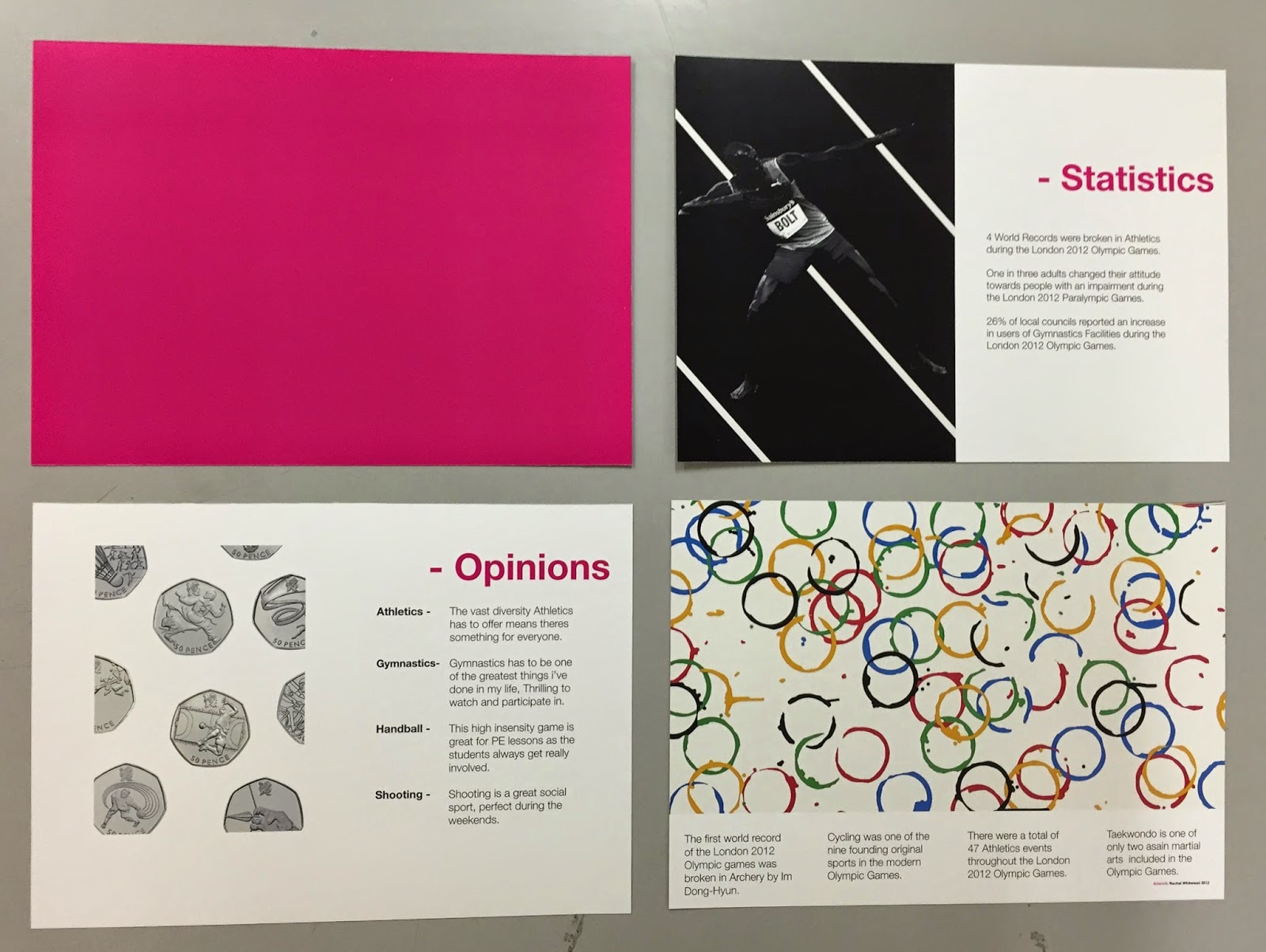
Finally brief 4 allowed me to elaborate on the research complied in briefs 2 and 3. I was introduced to identifying my own problems and writing a brief to resolve this. I feel this brief was alot more creative than some of the other briefs I have been given as it gave me opportuning to produce 3D outcomes that experiemented with different techniques such as laser cutting and drawing through the vinyl cutter. 


Overall I am happy with my progress through the module and my development so far in the course. I feel I have learnt a host of new skills such as expanding my knowledge of Photoshop and Indesign which will allow me to create higher quality outcomes in the future. I feel I have a better understanding of the design process as a result of this module and think I have worked more independantly through the course of this module, managing my time according and organising my own bookings, inductions etc. I feel this module has given me more independance when designing through choosinh my own research topic and writing my own briefs, I have enjoyed the development of a concept from researcing to ultimately identifying a problem and solving it accordingly. 

Saturday 17 January 2015

Studio Brief 4 - Evaluation & Time Plan Diary

Studio Brief 4 - Design Processes, Communicate
Evaluation and Time plan diary 

I was exceptionally pleased with the outcome I produced in response to this brief. I feel the outcome resolves the problem stated within the brief that there was nothing to do with the coins once collected, My product transforms the coins into a piece of art that can be displayed stylishly within the home to interact with more accessibly than if they were placed in a book or a draw. I think my outcome answers the aims I set myself, these were; 

I aimed to create a stylish and innovative outcome to the problem

I aimed to fulfil the brief in a practical manner that has real life application for a large audience

I feel I have fulfilled these aims as my outcome is truly innovative and unique, as I was unable to find any similar products on the market through my research. I feel I have achieved my second aim as the product could easily fit into a home environment, it would be fairly cheap to produce so would not be unaffordable for the target audience. Overall I think I have succeeded in creating successful solution to the brief through the development of an original concept that is both functional and has a great aesthetic.

Time plan diary; 

As part of the brief I was required to manage my time efficiently and document this accordingly, I feel I managed my time well as I had a range of components, some of which that required prior booking,  that all needed to come together in time for my final critique. 

Monday 5th - Briefing, book printing slot for outcome 
Tuesday 6th - Thursday 8th - Research, defining brief and initial ideas 
Friday 9th - Development of concepts/ideas 
Monday 12th - Interim Critique, Book laser cutting slot 
Tuesday 13th - Laser cut, development of artwork 
Wednesday 14th - Print artwork 
Thursday 15th - Cut and assemble outcome 
Friday 16th - Final Critique

I stuck to my plan relatively well however needed the majority of Wednesday (14th) to complete my artwork as I changed my concept and needed new artwork to match the clinical style of the laser cut mount board. I feel I managed my time well however if I had longer to complete the brief I could have experimented with more colour variations and styles of pen for the creation of my artwork. 

Friday 16 January 2015

Studio Brief 4 - Cut, Colour & Assembly

Studio Brief 4 - Design Processes, Communicate
Cut, Colour and Assembly

With my mounting board cut using the laser cutter and my artwork produced on the vinyl cutter the next stage in my manufacturing process was to cut the artwork to size and cut the heptagonal inserts out. I was initially concerned that the artwork wouldn't line up with the mount board cut outs so the heptagons are in the correct place to relate to the venues however as I produced both files in illustrator they worked with the same boarders etc to ensure both elements of my design lined up I had to print my artwork on A2 card. For the cutting I placed one mount board cut out over the artwork and alined the cut out heptagons of the mount board with the position they needed to be cut from in the artwork. I used a digital file showing an outline of the heptagons on a tube map to ensure that I had the artwork correctly aligned. 

Once aligned I used tape to keep the components in position to ensure that any of the layers did not move while I was cutting. I then used a craft knife to score along the edges of each cut put heptagon individually before cutting the excess of the A2 page away leaving the A3 artwork with scored heptagons in position to align with the laser cut mount board. Unfortunately the intricate shapes meant that the I did not fully cut the heptagons from the artwork in the first cut, I then untaped the artwork from the mount board so I could cut the card easier. The first cut had left scored marks in the card this meant it was easy to cut the heptagons from the artwork accurately. 


COLOUR CHOICE;

With both colour variations cut out I placed my series of coins into the mount board to simulate a finished outcome. I then placed the White and Silver variations over the coins to see which I felt worked best as a finished outcome. I couldn't see that one variation was better than the other, they both had strong and weak design features for example the white variation was bold and contrasted well against the black stock background, it also varied the colour scheme when the coins were inserted, however weak features included that the accuracy was not as good as the silver variation due to the liquid ink bleeding slightly on the page. I found that the silver variation had strong design features such as it was extremely accurate and the detail was better that the white variation, also when it caught the light the silver of the get pen sparked and looked very stylish with the coins, however weak design features included that it didn't stand out as much as the white variation and from a distance some people said it looked greyscale. 

I asked a range of students and lecturers for their opinions as to which design they preferred, I found that the results were around 50/50 with different people supporting different variations for a rang of reasons, some of the comments included; 

'I like the white because it's bold and stands out really well' 
'The white makes the coins look sparkly' 
'I like the white but don't like the lack of detail in the logos etc' 

'I love the silver its far more stylish' 
'The silver matches the coins' 
'I like the silver but from a distance it just looks grey' 

Having taken onboard all these opinions I concluded that the variations were just down to personal preference, having concluded this I decided to choose the silver variation to be featured on my final outcome. I chose the silver design because the detail was better and it gavotte outcome a higher quality finish. Also I thought the silver looked more subtle and could see it in a home environment more that the white as I felt it was too bold and would not blend in with a range of rooms. 

White

Silver


Having chosen my final artwork all that remained to do was to bond all the components together to complete my final outcome. I chose to bond my components with spray mount as it is strong and easy to apply it also means that the card will not distort as it often can with other adhesives such as PVA. I placed one of the mount board pieces over the backing sheet and inserted my leftover mount board heptagons I made as a byproduct of creating my cut out mount board sheets, I then removed the cut sheet leaving only the heptagons paced on the mount board backing. I did this so that the these areas will not be covered in spray mount as it could permanently bond the coins to the sheet which was not acceptable for the purpose of my concept. I then sprayed both surfaces and bonded them together. I continues this process with the other layer of mount board and artwork to complete my final outcome. 

I was really happy with the final outcome I feel the product has a great quality and looks extremely aesthetically pleasing, I think the outcome answers the problem defined in the brief and resolved the aims I set creating a product that is both functional and has a great aesthetic.

Studio Brief 4 - Drawing

Studio Brief 4 - Design Processes, Communicate
Drawing

When it came to manufacture my outcome I had to consider all of the different components within my final outcome. As I had to book in to use the laser cutter this component has already been produced. I started with the artwork for my outcome for this I needed to use the vinyl cutter in the digital print resource, this was good as there is often no booking required for this piece of equipment. I had previously source my stock and pens ready to manufacture my outcome. I purchased black card from the College shop and sourced white and silver gel pens from staples. I decided to crete two variations of the design, one with white pen on black stock and another with silver pen on black stock, I thought these would produce different results and I could then pick the most appropriate outcome. 

I started by converting my file from a filled vector to a series of tightly spaced lines as the vinyl cutter ignores filled spaces and would just draw out the outlines, creating tightly spaced lines ensured the machine would fill the document essentially colouring it in. I had to get the technician from the print resource to assist me as I had never used the equipment before.


The technician then set the fed the pen into the machine and set the correct tolerances before starting the drawing process. I was really impresses with this process as the pen was so precise filling the page with my design with such accuracy and speed.  The process took around 20 minutes to complete but I estimate would have taken over an hour to draw by hand and the accuracy would have been far worse. I then switched the pen for the silver gel pen and created my second variation, due to the ink in the silver pen I feel the accuracy was better in the silver variation as the white pen used liquid ink which bled slightly on the page causing the small intricate text of the logos to be lost. When I saw both finished designs I thought they both looked incredibly good however I still could not make a clear decision as to which I would use for the final design, I decided to cut out both designs and lay them over the coins to see which looked best as a finished concept, I will also ask other students and lecturers for their opinions in order to make an informed decision. 


White

Silver

Studio Brief 4 - Revised Artword

Studio Brief 4 - Design Processes, Communicate
Revised Artwork 

Having seen the high quality results the laser cutter produced I then questioned if the abstract design of the artwork would contrast with the clinical and precise outcome of the laser cut boards. I felt that the artwork would not blend with the other aspects of the concept making it look out of place. I asked a number of students who had mixed results towards this dilemma, The best feedback I received was to create an alternative design that is more regimental and fixed and then compare this to my initial abstract concepts to see which will look best on the mount board backing. 

For my new graphic  I then looked at the original London Underground tube map, designed by Harry Beck this is a great example of British Graphic Design which I felt would work well as a piece of artwork due to its bold style and audience appeal, due the the underground being a stereotypical feature of Britain to tourists etc. I started by sourcing an image of the underground online, I wanted to make the image bold and eye catching. For these reasons I chose to remove the names of the stations and the grid from the existing image, this just left the core lines of the tracks which was bold and I felt instantly recognisable as an train map. 


I thought of innovative ways to print my artwork, I considered screen printing and digital printing and felt these would produce good quality results. I then remembered in my print induction that the vinyl cutter could produce illustrator drawings by replacing the blade with a pen, I thought this would achieve a really high quality finish, I also felt it would match the clinical precision of the laser cut boards well as the vinyl cutter will draw out the tube map with a high degree of accuracy. 

I then transferred my photoshopped tube map into illustrator and used the image trace software to convert it to a vector ready to print. I considered a range of colour schemes however I felt black stock with a white gel pen would create a bold effect that would like constellation art with the coins looking that shining stars due to their metallic properties. I needed to add minor alterations to the original map as it did not include the national rail line which featured two of the venues. It was easy to add this in when the drawing daw converted into a vector as the map uses straight and angled lines so I ungrouped the image and compiled components to create the missing rail lines. I also added the London underground logo to reinforce that it was of London and the 2012 Olympic games logo to show the collaboration between the two and reinforce the series of coins I am designing for. 


Studio Brief 4 - Laser Cutting

Studio Brief 4 - Design Processes, Communicate
Laser Cutting

As the brief stated I needed to store / Display the series of coins I thought the most appropriate way to achieve this would be to use mounting board. As it has a thickness of roughly 1.5mm it will securely hold the coins which have a thickness on 1.7mm. I had to schedule an appointment to use the laser cutter and I also had to arrange an induction to allow me to use the equipment, This required some planning and tested my organisation skills. I then created a vector image of the components I wanted to cut, I used illustrator as this was the software compatible with the laser cutter. 

Firstly I created a number of test pieces to test variations of my design, Firstly I wanted to test of if the coins would fit securely within the cut outs and secondly I wanted to test if I should use one or two layers of mount board to store the coins. The results of my testing showed me that the cut outs were a good size to store the coins, the fit was snug and ensured the coins didn't move about, I then looked at different thickness of mounting board and after some feedback from other students decided to use two layers on mount board to display the coins as one layer made the coins raise out of the board whereas two layers saw a seemingly flush surface, this also would prevent the coins falling out if hung vertically on a wall. 


Having tested the material I could then produce the board for my final outcome. I started by cutting the backing square that the coins would rest against,  I then cut the first layer of my coin cut outs followed by the second. I was really impressed with the quality of the outcome, the cuts were extremely precise and ensured a very high quality finish. 


Studio Brief 4 - Development

Studio Brief 4 - Design Processes, Communicate
Development

The first stage of my development was to find out where the olympic venues were in relation to the London underground map. To do this I printed an A3 map of the London Underground  and a list of the 2012 Olympic Venues. I then cross referenced the Olympic venues with the closest tube station by placing tracing paper over the map and asking students from London to assist me with identifying where the venues are located. I found this really interesting a when I removed the tracing paper the plotted points created a cool abstract pattern however this had a genuine relevance when placed against the underground tube map. 


Following this I then started developing my abstract underground concept. To do this I started by identifying a range of iconic British artists and analysing their work to see if it would look appropriate in a bold, illustrative format. I decided on works from Damien Hirst, Henry Moore, Barbara Hepworth, Tracy Emin and Gary Hume. I thought I would need a range of their works to create an interesting collage so I collated 2 artworks each giving me to designs to develop and work with. I then used Illustrator to create vectors of the art, I used the pen tool creating a purposely sketched finish. I then imported these vectors into photoshop and experimented with the layout placing the art around the page. I think this worked well, I then further developed this from black symbols to off white creating a subtle contrast between the page background, I fell this prevents the page from looking too busy as this was a concern raised in the critique. I like this section of the design and think it will look effective with other layers on top creating an abstract piece of design. 


Marbling;  I wanted to create an abstract interpretation of the River Thames but was unsure about what medium to use. I asked for other students opinions on how I could use different mediums to create water effects. One student suggested marbling ink and showed me some images of work she had created using the ink, I thought it looked really abstract and innovate.  I bought some blue marbling ink from a local art supplier and created my own marbling effect. I was extremely happy with the outcomes as it made fluid patters that could represent the water of the Thames. I then scanned these images in and looked for patterns within the ink that roughly reflected the twists and turns of a river.  I then removed the excess pattern and adjusting the affects such as hue and saturation to create a bold abstract river that I feel works well. 


Thursday 15 January 2015

Studio Brief 4 - Interim Critique

Studio Brief 4 - Design Processes, Communicate
Interim Critique

We were split into 4 groups and conducted our interim critiques for Studio Brief 4, I found this really useful as  I was able to get feedback on my concept and see peoples opinions towards my initial designs. I also found this critique especially engaging as we wrote our own briefs every persons was different, it was great to see the problems and ideas people had created in response to their own briefs. 

I explained my concept and showed the group some rough sketches of my designs to get feedback. Some of the comments included; 'Really creative' 'I like the idea of physically documenting venues geometrically'. Some of the group though it required a lot of work considering the short about of time we had to produce the outcome. One student said I was 'ambitious' and another said 'I think it will be easier to crit when you've actually started making it because its hard to visualise the concept.' 

When I asked them about the designs of the display art one student said 'I'm not sure if a harry beck style of illustration would work as all the other elements of the design are very abstract' I agree with this but feel I would have to experiment with it to know if the elements of the design come together. Another student said he thought it might be too busy and that I should consider simplifying it. I agree with these comments but feel I will have to experiment with the design to know what works best.  I am taking on board all of the feedback gained in this critique I especially agree with the fact that it may be easier to crib once I have started making it as then I can physically explain my concept, I will do this by holding an informal critique during a studio development session, I think this will lead to a better understanding of my concept and more in-depth feedback. 

Studio Brief 4 - Concept / Initial Ideas

Studio Brief 4 - Design Processes, Communicate
Concept / Initial Ideas

Having researched existing products and finding a potential gap in the market I felt ready to create a range of initial ideas. I wanted to start where I left my research, by looking at a potential gap in the market for a new form of coin display that fully displays the series of coins. One of the problems I identified from my research is that even though the royal mint store stocks collectors albums, I feel they do not display the collection very well as the book will most likely be placed in a draw or on a bookshelf with minimal interaction once completed. As the problem I identified was that there is nothing to do with the coins once they have been collected I feel I should create some from of display art that shows the coin collection and can be easily interacted with.

 This lead me to define my final concept for the brief. I intend to create some from of wall art similar to a poster with cut outs that the coins can be inserted into once collected. This will create determination to collect the coins to finish the piece of artwork, It can then be displayed on a wall as a piece of art that also displays the collection, it will ensure that the collection is always on display to be interacted with by guests etc. I am extremely happy with this concept as I feel it is innovative and will create some unique results through the design of the graphic art and assembly of the final outcome. 

Now that my concept has been fully defined I can proceed with creating a range of initial ideas.  I am basing my designs around the series of 2012 olympic games 50 pence pieces as this was my main focus during the research of Studio Brief 2. I started by creating some initial sketched of how I wanted my final piece to look physically, this included an exploded view drawing (seen below) showing the estimated assembly of the outcome. I think this method would work well as the layers of material (most likely mounting board) will provide enough thickness to encase the coins so they could hang on a wall without falling out, I plan to use the laser cutter to cut the shapes from the material this will then be bonded together with my final graphic placed over the top in order to create my final outcome. 


Following on from this I then started to sketched out some initial ideas for the graphic of my artwork, I wanted the overall aesthetic to be bold and graphic. I started by brainstorming ideas and thought created a range of designs. The first being a collage of famous British artists work, this would included the likes of Henry Moore, Damien Hirst and Tracy Emin,  I would take examples of their works and create bold vectors in my own style to create a collage. The second idea drew inspiration from the famous London Underground tube map designed by Harry Beck, I planned to use this with the coins fitting into the the olympic venues all over London. I liked this idea as it used a range of components that all worked well together, the use of British designer Harry Beck and his tube map which is iconic and will appeal to an audience would work well with the coin series creating a British work of art. The third design is a combination of the two, I designed an abstract variation on the london tube map with a subtle collage as a background contrasted against an abstract river thames and rail map. 


Studio Brief 4 - Research

Studio Brief 4 - Design Processes, Communicate
Research

Having written my own brief I can now start to research background information that will inform my initial ideas. I started by looking for existing forms of storage and packaging for coin collecting, for this I felt the most appropriate source would be the royal mint online store.  I thought if coin displays existed they would be featured here. 

I found a small selection of collectors albums in the 'shop' section of the royal mint website, the collectors albums all featured the same design for different collections of coins.  I found the design to be relatively dull as they features large water colour illustrations similar to those found in some children books. I think the target audience of this product is children as they use figurative language such as 'fun' 'colourful' and 'hunt' when describing the collectors album. This leads me to suggest there is a gap in the market for some form of coin display for adults and avid coin collectors, I feel this could be the best possible solution to answering the brief. 


Seeing the bold illustrations of the Royal Mint collectors albums made me want to focus on a more designed and artistic style of design to ensure my outcome isn't too similar to an existing product. I started by looking at a range of display art as this would give me a better understanding of how I could design something with the purpose or storing/displaying items. 
When looking on search engines such as google I found it extremely difficult to find something that worked harmoniously as storage and art that could is produced on a relatively small scale. I found examples of designer shelving and artistic installations however didn't find anything resembling the concept I envisioned. This made me think of how I can develop my initial concept as an innovative new design. 

Studio Brief 4 - Problem and Brief

Studio Brief 4 - Design Processes, Communicate
Problem and Brief

I planned to collate a range of research to help me with the brief. I started identifying problems with coin collecting. To collate this data I asked a sample of people what they felt were the main problems with coin collecting. Some of the most popular responses included; 

- Its unappealing and boring
- It takes coins out of circulation 
- The coins are hard to find and collect  
- There's nothing to do with collected coins

I then looked at these problems individually, looking for potential to resolve one of the problems, I considered trying to make coin collecting more relevant but thought realistically this would be extremely difficult with all of the modern day technology that is more appealing to the younger generations. To address the issue of taking the coins out of circulation I couldn't think of a good stragegy to avoid this as it is essentially contrasts the act of coin collecting, I then considered creating a guide on how to find and collect coins however in the past two studio briefs I have worked with an editorial style of design and felt the outcome would look too similar. I then considered the final problem of theres nothing to do with the coins once they have been collected, I thought I could work with this as I couldn't think of anything that people do with coins once they have been collected. I also thought that this would lead to an interesting brief with the potential to create some unique and innovative outcomes.  Having analysed the problems to do with coin collecting I decided to write my brief around the concept that theres nothing to do with the coins once they have been collected. 

Brief; 

Brief - Produce a new packaging concept for collectors to store and display a series of coins. You should consider a visually consistent theme and the practicality of your final concept. 

Background considerations - Look at existing coin storage concepts, Identifying the strong and weak design features. 
Considers your work load and plan your time accordingly. 

Mandatory requirements - Final concepts must be able to hold/store more that one coin. 
Final concepts must be three dimensional. 

Deliverables - A resolved three dimensional packaging concept
A quantity of visual research 
Documented development of your final concept 
A minimum of 4 design boards covering; 
- Research 
- Development 
- Manufacture

Studio Brief 4 - Introduction

Studio Brief 4 - Design Processes, Communicate
Introduction

Brief; 
You are to identify a problem from your individual research and provide an answer to it through the identification of and packaging of a product. You must the resolve this problem in an engaging and interesting way to a specific target audience.


I am looking forward to starting this brief as it is my first attempt at writing my own brief, I think this will make the brief more engaging as I can identify a problem I feel is a result of my combined research spanning over Studio Briefs 2 and 3.   I will aim to identify a relevant problem relating to my research this will test my problem solving skills and should ensure the briefs remains engaging from start to finish. 

Research plan; 
I aim to undertake a range of research throughout this brief. Firstly I will collate a range of primary research research to establish peoples opinions on the problems with coin collecting, I will then use this to see if there are any trends that I could exploit and use as my problem. Once I have identified the problem I can then write my own brief, for this I will research other briefs posted on E-studio to gain an understanding of the terminology and style used within brief writing. Following this I can then start to research the problem in more detail, looking at internet sources and seeing if there are already any existing resolutions to my brief before I start to create a range of initial ideas. I will then present these concepts to a group of students in an interim critique for feedback as to whether they think my concept would resolve the brief. 

Interpretation of the Brief; 
My interpretation of this brief is that it is a lot more independent that the previous briefs we have been given. Firstly it requires me to write my own brief as a result of identifying a problem with the research collated over studio briefs 2 and 3. Secondly it requires to me to manage my time efficiently throughout the use of a time plan diary that should be submitted with the module. I think this brief will provide me with an opportunity to think more critically about the problems I am faced with and design for a specific purpose as a result of the problem I have identified, I feel it will ultimately provide justification behind the brief as I will have identified the problem and developed the solution.

Studio Brief 3 - Manufacture

Studio Brief 3 - Design Processes, Page Layout (Indesign)
Manufacture

I printed my book with full bleed imagery this meant I had to print my pages on a3 paper so that I could achieve a boarder-less finish. I then had to cut the pages to size by hand. As I printed the pages from Indesign it meant I could easily add crop marks for precise cutting. I cut the pages using a metal rule and craft knife as I felt this would give the most accurate finish, as I find guillotines can often be temperamental and I needed my pages to align at perfectly to create the book. 


The next stage was for me to fold each page in half so that I could slot the individual spreads inside one another to assemble the book. I used a Bone Folder to fold the pages as this replicates industry practise and allowed me to achieve a high degree of accuracy. I encountered problems while folding the pages, Due the nature of my design I had to print a range of block fill full bleed backgrounds, this looked bold and eye-catching however due to the thickness of the glossy stock and the ink, when I folded the individual spreads the ink cracked due to the stock being manipulated. The only way  I could avoid this would be to print on coloured stock instead of printing the background onto white stock, However due to time restrictions I could not source coloured stock as they did not sell it at university. 


Overall I am happy with the physical book, I think the spreads look great on the glossy stock as they reflect a high end sporting programme. The colours are bold and luminous with the pink being especially eye-catching. The overall design is very modernist due to the use of generic conventions such as Helvetica, Tschicholds canon and a minimal colour scheme however I have personalised this with the use of the bold pink used in the London 2012 Olympic Games. If I were to produce this book again I would definitely look at printing on coloured stock to avoid the ink cracking as  I am unhappy with the assembly of the outcome, however due to time restrictions and stock availability I was unable to reprint the publication. As part of the brief we were also required to submit a PDF of the final outcome, I was very impressed with the ISSUU software used as it gives the book a great online aesthetic, I am extremely pleased with the PDF outcome as it shows the book in the great quality that I intended without the errors in the physical manufacture.


Studio Brief 3 - Print

Studio Brief 3 - Design Processes, Page Layout (Indesign)
Print

The brief was very strict with the printing method of my booklet, it stated it that the publication had to be printed using the digital print resource publication printer and staple bound on the a specialist printer.  When I went to enquire about the stock and method of printing I found that the printer could print on paper up to 400GSM however encountered a problem that the machine could not print full bleed images and staple the publication, This meant I would have to staple the book manually. 

I chose to print my book on a double sided glossy stock, I felt this would look the best in terms of putting the design into context. I wanted the book to resemble an event programme, similar to those commonly sold at sporting events such as Athletics and Football. I was initially concerned that the pages would look tacky if the pages were too glossy however I found the stock worked extremely well with the bold rich colours used within my publication. I am happy with the quality of the print, I feel the pages look good on the stock and the colours are bold and eye-catching. 


Wednesday 14 January 2015

Studio Brief 3 - Development

Studio Brief 3 - Design Processes, Page Layout (Indesign)
Development

Having created a range of initial ideas informed by my research, I felt confident enough in my initial concepts to develop them in a digital medium in order to create my final page layout designs. 

Covers; 
Following on from my plan I started by choosing a bold block colour for the background of the page. I experimented with the colours of the olympic rings however found these to be too bland as they include primary and secondary colours. I then looked back to my initial research from Studio Brief 2, As the content of the book is based on the London 2012 Olympic games I then researched the branding and found a luminous pink was frequently used within the campaign. When I tested this as a aground colour I thought it worked really well as it stood out as unique and different yet reinforced the content of the book in a subtle and innovative manner. 

I added text in Helvetica which worked extremely well in black contrasted against the luminous pink background, I tested the sub-title in white and black however thought it made the page look more interesting with a 3 colour swatch as it brightened the overall aesthetic. I then added the heptagonal shaped to create my first attempt of a finished design (seen below).


I then experimented with the design of the heptagonal shaped, filling in a random selection of the shapes with my swatch colours of black and white to create an unique pattern that is abstract yet structured (below left). I liked this design however when I asked for feedback from lecturers and students they asked if the pattern represented anything, this added a layer of confusion which made then less sure on the design, one comment included 'I like the design but I don't get the coloured in 50p's, do they mean anything?'. I also experimented with filling all of the heptagons in again in a random pattern (below right) however all the comments regarding this design were negative with the most common being 'Its way too busy'. From this I then selected the first variation of my design (seen above) as the final design as I feel its minimal look is very modernist by nature and its aesthetic is bold and contemporary. 


Words page; 
I had a vision for the words page to be used as an inside cover, I felt this would work best as  there was not a lot of content and it wouldn't make a particularly interesting spread. For this I asked my designed the page as a printers spread instead of a readers spread this meant that half of the spread would feature on at the front of the book as an inside cover and the other half would feature as the very last page before the back cover. I thought this worked especially well as it works as a nice subtle introduction to the book. I used the design of this page to reinforce my three colour swatch of pink (Pantone 226C) Black (Pantone Black 6C) and White (Pantone 663C). I like this 3 swatch colour scheme as the black and white is of a typically modernist nature however the pink is bold luminous and fresh, it brings the pages to life and is relatively unusual to see the colour void of any gender connotation. I then started experimenting with the placement of text, I initially placed placed my words top left justified left as this is another modernist trend I tried to incorporate within my designs. I used Helvetica as I decided this would be my body copy throughout due to its connotations of modernist design. To make the design seem more contemporary I then experimented with the leading and found that it looked best with the words overlapping in different colours so they were still legible. I think the final design looks contemporary and bold with the use of the block fill black to contrast against the luminous pink of the front cover. 


Coins page; 
For the coins page I wanted the layout to reflect the content. As there were 30 coins commissioned by the royal mint I placed 30 heptagons around the text to symbolise the 30 commissioned coins. I then experimented with the arrangement of the coins and found that the layout looked best with the coins in a clean rectangle with the text extending into the white space creating an edgy look that is contemporary yet still fits the modernist theme. For the imagery I had a vague idea of what I wanted the imagery to look like, I envisioned a repeat pattern all over the page of coins featuring a selection of the coins depicting different olympic events. I created this in Photoshop and imported it as a TIFF to Indesign as this is the best file type to preserve the file quality. I experimented with 2 versions of this design one filling the while left page of the spread as a full bleed image (seen below left) the other conforming to Tschicholds canon (below right). I then asked a range of students for their opinions and found the second variation using Tschicholds canon was the most popular with comments including 'I like the use of white space surrounding the imagery'. I am happy with the final design of this page as it fits to modernist principles yet has subtle variations that makes the design unique. 


Quotes page; 
My quotes page was follows my initial plan well, I have used a full bleed image photoshopped to incorporate the colours of my swatch, this is then contrasted against the stark white right side of the spread, The white space juxtaposes the black background of the imagery with the pink adds a bold splash of colour that prevents the page from looking dull at a glance.  I have photoshopped the image of Usain bolt in photoshop, the original was full colour and not very aesthetically pleasing in terms of a design style, I experimented with photo filers and effects until I created this dramatic monochrome image, the athletic features of bold are accentuated through the light shining onto his muscles. even though the image is  relatively difficult to see at glance the shirt clearly says the athletes name allowing the reader to understand the relevance of the picture even at a glance. I have aligned the text with focus points in the picture for example the body copy is lined up with the athletes pointing hand across his chest, I feel this balances the image well creating an aesthetically pleasing layout. The main focus points of the spread fit within Tschicholds canon creating a consistency throughout the pages. 


Facts page;
Similarly to my quotes page, my facts facts flowed naturally from my initial plan. I started by drawing Tschicholds canon to fill the spread, I then filled created a test plan filling the image to the bottom of the text boxes on the page (roughly 3/4) page full, I then created a text fox full of placeholder text to get an idea of what the final layout would look like. I liked the results so decided to continue with this concept. I searched for a range of images I could use for the large image and was instantly attracted to an artists poster by Rachel Whiteread commissioned to celebrate the 2012 games. Initially I intended to find an image to and manipulate it using photoshop to make it unique however I thought this image worked really well so decided to use it as my main image (the only small manipulation I made was altering the background from cream to as a slightly off white as then allowed to to flow seamlessly into the text at the bottom at a glance. As I used the artists image I also quoted the artist in the bottom right corner. I then split the text box at the bottom into 4 columns as this looked aesthetically pleasing and very modernist, I filled this with my facts to create my final page design. I am happy with the design as the imagery is striking and creative, although it contrasts with the strict nature of modernist design the columned grid balances this well. 


Statistics page;
For my statistics page I wanted to follow a strict grid, similarly to the rest of my pages I followed Tschicholds canon to create a bold modernist feel to my design. I wanted to incorporate a large heptagon to reinforce the coins the content originated from. At first I created the outline in the pink from my pallet and a variation with a block fill heptagon. I knew the block fill worked best as it was bold and vibrant however I felt it lacked detail, I trailed a series of variation incorporating the queens head as this is the common feature on all coins. My first variation (variation 1) was to photoshop a cast of the queens head onto the heptagon however this was quite photographic and it didn't work with the vector style heptagon illustration. The second variation (variation 2) I used a silhouette of the queens head against the bold fill which created an instantly bold and graphic illustration. I asked a range of students which design they preferred and similarly to my personal oppinion the  bold illustration (2nd variation) was the most popular. The text is standard to the rest of my layouts with a 22pt body copy of Helvetica Neue light in black and a larger Helvetica Neue bold in pink for the titles. 


Variation 1
Variation 2 

Opinions page;
Typical Modernist design uses photography for its objective nature, with this page layout I wanted to demonstrate this principle. As the page content was on opinions I thought about how opinions are unique to the personal, when brainstorming unique features I thought of fingerprints, this lead to the basis of my design. I used Acrylic paint to create a range of my own fingerprints, I then scanned the best results in at 12000 DPI to increate the size of the image however because the image was so small a small amount of distortion still occurred. I then manipulated this in photoshop creating a monochrome image with a high contrast to increate the depth of the blacks. I anchored this with the text 'my opinion is MINE' as I felt this would reinforce the opinions content and create a clear link between the fingerprint and the text. I then experimented with the position of the text and image on the page, I found that the image fitted well within Tschicholds canon and the body copy mirrored this with the 2 columns both aligning with points in the canon. I was happy with the outcome of this layout as I felt it the aesthetic was very modernist yet it still remained contemporary and unique with the use of the bold pink to raise elements of the layout. 


Overall I am extremely happy with the result of my developments, Each page is different and unique yet the publication still flows sue to the standardised features such as body copy, swatch and grid. There are a number of typically modernist features present throughout my designs for example the use of black and white, an abundance of white space and the use of Jan Tschichold's canon that can be applied to every page however these features are complemented by unique quirks that make the design unique and innovative for example the use of bold luminous pink and the use of illustrations and bold artwork instead of the typical objective photography.