OUGD504: Brief 3: Type In Context
Development: Illustration layout
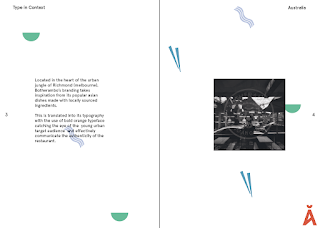
Taking inspiration from the carhartt clothing based on feedback from a tutor I started to experiment with the placement of the illustrations around that page in the hope of achieving a more playful and engaging aesthetic. Placing the illustrations around the page with more space created a more abstract aesthetic that contrasts the structured nature of the text and image, This contrast is effective in making the spread more aesthetically playful and creating more white space between the individual illustrations.
Taking inspiration from the carhartt clothing based on feedback from a tutor I started to experiment with the placement of the illustrations around that page in the hope of achieving a more playful and engaging aesthetic. Placing the illustrations around the page with more space created a more abstract aesthetic that contrasts the structured nature of the text and image, This contrast is effective in making the spread more aesthetically playful and creating more white space between the individual illustrations.
Unsure if the illustrations were too large on the page I reduced the size to produce a creative repeat pattern similar to the Carhartt pattern that formed inspiration for this design. This arrangement is simple, playful and vibrant that fills the white space. This design will appeal to the target audience and adds a playful tone that will make the content more engaging with the custom illustrations adding context and excitement to the spread.
Based on further feedback from students
I incorporated a line version of the illustrations into a spread creating
an alternative variation, in concept this sounded like it could have been
effective however in practise it doesn't add anything to the design.
The lines feel quite structured adding to the overall structured aesthetic
of the spread and don't connote the playful aesthetic I was aiming
for there feel it is unsuccessful.
Feedback:
 |
| Preferred arrangement |
I then presented these
designs to a range of students to see how they feel the illustrations
work within the spread. The majority of the students I asked for feedback
told me that they preferred the arrangement with a small repeat pattern of
the icons as they felt this was the most playful response. One student said 'I
really like how the icons are tailored to each individual picture as it
puts it in an instant context that supports the text' 'I prefer the smaller
icons dotted around everywhere because it makes it more fun and the bigger
ones look too full on'
I then asked my tutor in a sign
up tutorial for feedback as to which arrangement he felt would be the
most successful. He agreed no illustrations would leave the spreads too
minimal and agreed with the consensus of the students that the
smaller icons were the most effective in creating
an engaging layout that is aesthetically pleasing with playful icons
that complement the structured nature of the type and image. From this
range of feedback I will develop the smaller illustrations into a final spread
that will be consistent across the whole publication.


No comments:
Post a Comment