Studio Brief 3 - Collaborative Practise - Leeds Library Exhibition Branding
Initial research
As proposed on the day we were briefed we suggested that over the weekend we should individually research a range of exhibitions that included looking at the branding of galleries and exhibitions, researching at promotional materials, finding unique concepts and exploring how the exhibition space is used in a range of exhibitions and galleries, both related to graphic design and the creative world in general. I felt this was a good idea as it meant that on our first real session we could immediately start looking at this broad range of research that would be collated from everyones individual research and could immediately start ciritiqing these examples, instead of using the first half of the day to research branding which I feel would have been a less productive use of the time we have together as a group.


As proposed on the day we were briefed we suggested that over the weekend we should individually research a range of exhibitions that included looking at the branding of galleries and exhibitions, researching at promotional materials, finding unique concepts and exploring how the exhibition space is used in a range of exhibitions and galleries, both related to graphic design and the creative world in general. I felt this was a good idea as it meant that on our first real session we could immediately start looking at this broad range of research that would be collated from everyones individual research and could immediately start ciritiqing these examples, instead of using the first half of the day to research branding which I feel would have been a less productive use of the time we have together as a group.
I started by looking at art galleries to find examples of branding I felt was successful. I looked at local gallery the Hepworth based in Wakefield and found the inspiration behind their advertising campaign from Newcastle based design agency SUMO. Their brief was to create an engaging campaign to inform, create awareness and encourage attendance of the gallery. They took inspiration from the iconic shape of the building which they felt would be recognisable to an audience. They then combined this unique shape with intriguing strap lines provoked curiosity without giving too much away. They stated they wanted to create an air of mystery about the campaign that would intrigue the audience.
They rolled out this campaign across a rage of materials from 48-sheet posters and local flyers to national railway campaigns and niche arts publications. This campaign resulted in 100,000 visitors within the first month of the gallery opening and 500,000 visitors within the first year proving the campaign a success. I feel the campaign was successful in using the unique shape of the building as inspiration combined with playful strap lines and bright colours to create an engaging campaign that will become iconic of the Hepworth gallery.


Design blog 'Its nice that' produced an extremely useful post about he most striking identities for the 2013 end of year student shows. This allowed me to see how a range of young designers had branded their own exhibitions using a range of marketing materials to short films, GIF's, 3D products and innovative invitations to make them engaging to their target audience. The blog highlighted a range of branding from a number of universities, my personal favourite was the Goldsmiths College of Designs branding for their exhibition 'This is war'. I liked this simplicity of the design with a minimal colour scheme and the singular gold wire running throughout the playful fold out invitation. I think this identity worked well in creating a sophisticated yet creative branding that would appeal to a large audience. the full post including the 9 institutions with striking identities can be found at http://www.itsnicethat.com:8080/articles/degree-shows


As part of my research for Brief 2 I came across an exhibition produced by the Royal College of Art celebrating the 40 year anniversary of Victor Papanek's seminal text Design for the Real World which featured in the 2012 London Design Festival. I liked the branding for this exhibition as I felt it was extremely contemporary and the use of angled text and geometric pattern worked well to create a strong visual identity.
I research the identity of several exhibitions and really liked the branding for the The Vienna Secession Poster gallery held in the Neue Galerie in the spring of 2014. The designer Yeojin Rhee, created a new typeface to highhlight the variety of styles as well as the playfulness within the posters. She also created a range of patterns from the letters with I think works extremely well in using type as image. I think we could use a similar concept as the exhibition is about theoretical books so focuses heavily on type.


As a group we then looked at a range of exhibition designs and branding that we thought we could take inspiration from. We firstly looked at the exhibition design for the British Independent Film Festival. We were initially interacted by the overall interactive nature of the branding, each element had been considered individually and worked extremely well when put together creating a great user experience. We loved the perspective techniques used in the vinyl decals as this makes the exhibition more interactive and playful. This sense of playful interactivity continues as a theme through the collateral for example the perforated invitations that require the use to physically engage with the collateral. We decided that this interactive theme is more likely to engage an audience and remember the event, for these reasons we want to include some form of interactive feature within our exhibition as we feel this will work well in appealing to our audience. Overall brand used here is very minimal yet effective - using simple geometry and type which I feel works well and could be adapted to fit our concept.
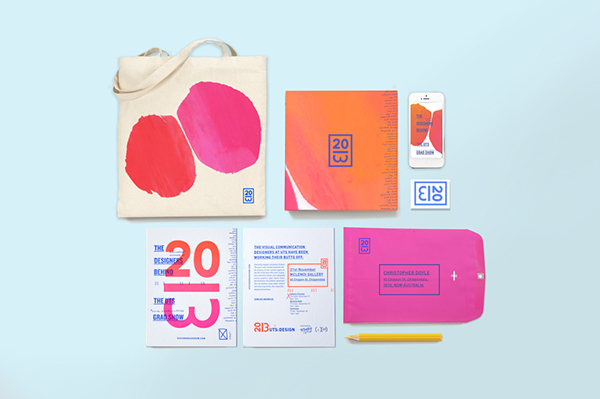
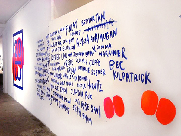
When looking at other forms of exhibition branding we took a particular liking to the graduate exhibition from UTS. We liked their ability to combine slick graphics with hand rendered typography and shapes. I particularly liked the use of gradients and bright colours used within this branding as it make the whole exhibition seem more fun and engaging. I think the branding fits the exhibition which is a celebration of students creativity however am unsure if this style of branding would work as effectively with our exhibition of book cover design. We especially liked the bold use of vinyl decals on the walls and decided we could produce something similar with vinyl to make the exhibition space look more inviting and engaging.
No comments:
Post a Comment