Screen printing
Having received positive feedback regarding my final design I felt confident that my final outcome would be of a high quality, I felt slightly apprehensive at screen printing my final outcome as it was my first time physically screen printing and I felt a certain amount of pressure as this would be exhibited within the public domain so I wanted my outcome to look as professional as possible.
I started by preparing the my colour separations for my screen print which I had received a tutorial session introducing us to the concept of colour separation. I found this relatively simple as the colours of my design did not overlap or interconnect so the colour separation was pretty straight forward. I added crop marks to my design based on feedback from second year students during the interim critique as they said this makes the process of lining up the colours much simpler when physically printing. Based on tutor feedback I also produced my positives on A3 so that I could cut my design down to size, extending the pattern beyond the A4 boarder also allowed me some room incase of problems that could occur during the screen printing process such as offset etc. I also got 3 students to proof read my document before printing these positives which was extremely beneficial as they identified that I had miss-spelt the authors name which would have looked extremely unprofessional if exhibited. Finally based on feedback from my final critique I increased the size of the title of sub-title as it was suggested the subtitle type size was too small and would not consistently reproduced through the process of screen printing. This created the final modifications that would ensure my final outcome has the higher chance of being produced as successfully and professionally as possible.
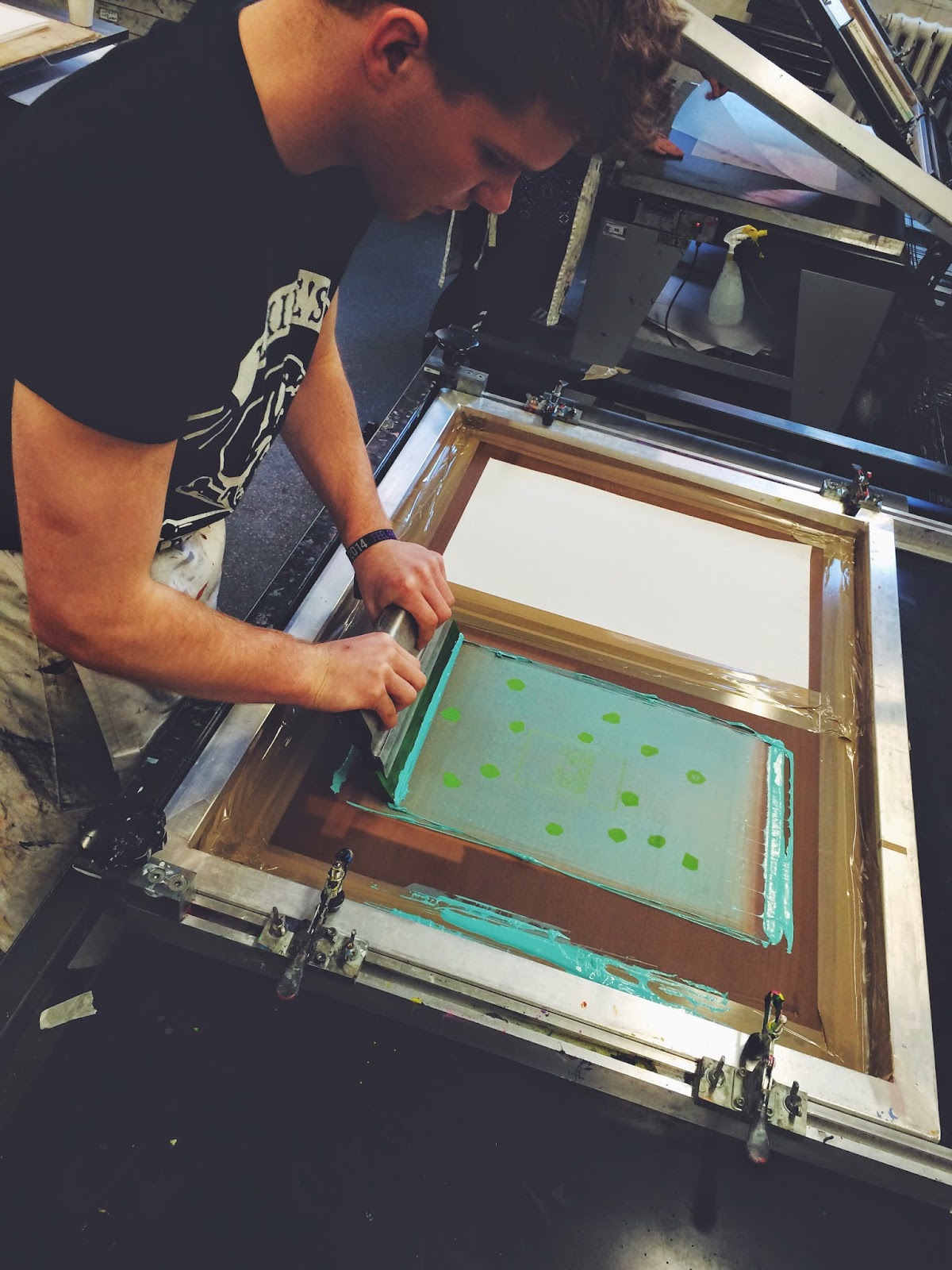
I was put in a group of around 12 students and and was scheduled the full day to produce my screen printed outcome. I started by giving my colour separations to the technicians at the Vernon Street print resource who exposed by screen using the ultraviolet light. While they exposed the screens I began by mixing my colours in preparation for screen printing, I found this particularly difficult for the yellow section of my screen print as digitally the colour was relatively opaque however this was difficult to reproduce with physical paint, I created a colour quite similar to this however it was far brighter that my digital colour palette, I was advised that the colour in the pot become more opaque when printed as only a small portion of the ink is applied to the paper. As there was support for both colour variation in my final critique it was suggested I screen print both colour variations in oder to see what the final outcomes looked like as this would be easier to evaluate the final outcomes as opposed to a digital representation. I produced inks for the remaining two colour separations which I found more straight forward as these required mixing less paint to achieve my intended colour palette.
Having prepared my colours and exposed my screen I was ready to begin screen printing I started my printing the green which would feature on all of my deigns as this colour was consistent across both variations. I placed my exposed screen into the vice and began screen printing, I found that it was easier than I had previously anticipated and I began to find it quite therapeutic. I experimented with a range of stocks including brilliant white, off white, coated paper and watercolour paper, This achieved a range of different finished that I thought presented their own unique qualities.
Having produced my first colour separation I then divided my stock up so that I produced both variations on an equal range of stocks. I then applied my second colour to half of my prints. At first I found it difficult to line up my designs so that they printed without any offset however once I had done this process a couple of times it became considerably easier, I am extremely happy that I incorporated crop marks as this made the process of aligning my separations much easier. I printed the yellow variation first, I found this to be darker than the intended colour produced digitally as this had more of a golden quality however I thought it still worked well in contrasting the green in a way that would compliment the aesthetic of the Library. I then produced the blue variation once I had rinsed by screen, I found this much simpler having had practice lining up the colour separations, similarly to the yellow I found this also came out darker than my digital version however I still felt the colour palette was appropriate to the environment of the library.
Once the prints were dry I transported them home to cut down to size, I opted to use a craft knife and ruler as opposed to a guillotine as I felt this would create a more accurate finish. I started by lining up the crop marks and cutting to just past the crop marks and not to the edge of the page as this would allow me to follow the crop marks all the way round as I found they disappeared if I cut the right the edge of the page. I felt I was accurate with my cropping which created a professional finish with a low offset. I was happy that I listened to feedback in my final critique and extended the mosaic segments beyond the crop marks as this allowed for minor offset and ensured that there were no white boarders surrounding the image.
Overall I am happy with the final outcome of my screen prints, I feel they look professional due to the fact the ink is consistent throughout the design, there are no white boarders due to offset and the text is fully legible. I will consult the advice of students and lecturers as to which final colour separation they feel is the most successful before choosing which variation to untimely exhibit in the Library. I feel my design is successful in communicating the content in a unique and aesthetically pleasing was that is derived from an innovative and interesting concept.
No comments:
Post a Comment