Design Principles
What is a book?
Content: Illustrations
I then followed a similar design process to my image development blog post Here by combining a range of hand rendered imagery with photography, texture and digital manipulation to create a consistent aesthetic throughout my publication. Unfortunately I became so engaged with creating the illustrations that I completely forgot to screenshot my development. Below are my final illustrations for my publication with a description highlighting the design decisions made and inspiration behind each individual illustration.
Hanging Quote - This design is predominantly illustrative with the sinister silhouette of a human figure hanging from a tree, this is then layered with hand rendered type quoting Ernest Hemingway and contrasted against the block yellow fill geometric shape to bright out the detail of the illustration and layered with the textured shape to add depth to the image.
Gutter - This illustrations plays on the connotation of being at rock bottom and in the gutters, this is represented throughout the image with stone and marble textures used and a grey colour palette The photography of the drain contextualises the illustration and this is they combined with a geometric outline and darker textures shape to create an intriguing image.
Scale - This image draws inspiration from lady liberty who famously holds the scales of justice, This image represents judgement and paying for your sins. The stone statue photography creates a harsh unforgiving aesthetic, this is then backed onto another stone texture to add weight the image. I have included a dark block red to contrast the harsh stone and brighten the image however this still manages to case a sinister tone over the image which I feel works well.
Leading - This design took inspiration from Cluedo with the lead pipe used as a murder weapon. I carried out extensive digital manipulation on this image, superimposing the lead pipe into a clenched first. I then added a light source and gradually faded the image out so that it looked natural. I backed this on bold textured shapes and referenced the alternative meaning of lead as an element (also poisonous) with the crystallised rocks used to subtly cover the end of the hand.
Orphan - The sombre image of a small child standing next to two gravestones represents her parents deaths and relates it to the content of the page. This is then contrasted on the pale red hand rendered gates from the famous salvation army Strawberry Fields Orphanage. This reinforced the content and makes the illustration more contextual and engaging. Finally this is layered up against the pale stone texture which gives an unforgiving and harsh aesthetic to this sinister design.
Rag - I initially struggled with my interpretation of rags as I wanted to use a child in ragged clothing but development felt this started to look too much like the orphan illustration and I wanted each illustration to be unique. I found this striking image online and removed the background layering on multiple textures including marble and included a vectorised illustration of close up ton fibres that I feel adds to the aesthetic of the image well.
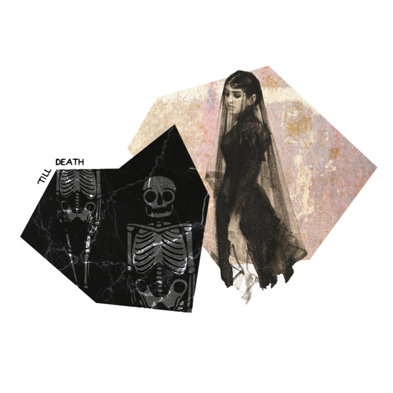
Widow - I decided to change this design from the initial illustration I created as I felt in retrospect it didn't flow as well as some of the other designs. I manipulated the image of famous painting 'The Widow' by Anders Zorn and accompanied this with the original skeleton design from my initial concept as I felt this worked well in adding a sinister tone, the cropped image could also be interpreted as the buried husband which I love.
River - Finally I took the drowning element of rivers as I felt this added the sinister twist the image I was looking for. I manipulated the work of photographer Alban Grosdidier blending it into the texture of water which I then grey-scaled to flow into one another, I added the outstretched hand to show desperation and wanted to be saved and layered this with dark fills and the murky ocean texture to add depth and reinforce the water element of the illustration.
I am extremely happy with the outcome of my illustrations. I feel they all have strong designs that relate to their content and they all work well within the concept of my publication adding a sinister aesthetic to my designs. I am particular impressed with how the geometric shapes work together to create continuity across the range of designs as they are all individual and without this element could have looked sporadic and not worked within the publication. I think that the images work well together to highlight my concept and still reference my initial inspiration of Geraldine Georges' that has been developed into my own style.
No comments:
Post a Comment