To reinforce my introduction to editorial design we were put into randly assigned groups of 5 students and given a headline to which we were to research the story and represent it in an aesthetically pleasing and appropriate manner. Our headline was 'Art forgers collection fetches £50,000 at auction'. No one in my group had any prior knowledge of this article so our first step was to research the story on a number of media outlets both locally and nationally. We would BBC news to be the best source of information as other websites often referred back to the BBC suggesting they were the original source of information.
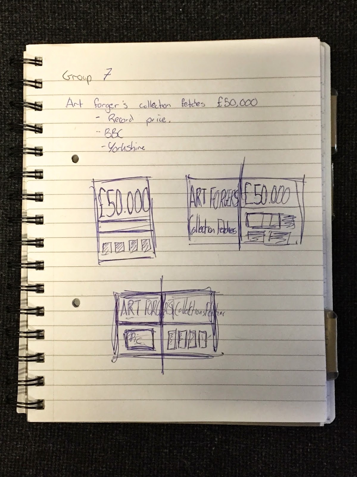 With the content established we could then look at the design of the page, I suggested a gallery inspired layout focusing on the white space and minimal clean lines often found at art galleries, this idea was well received by the group and was put forward as our main design decision. From this we then individually started sketching out quick designs and constantly referred back to the group for feedback, examples of this can be found below.

From these initial sketches we combined our individual components to form the basis of a generic layout we could use to present our story. This lead to creating a detailed hand rendered grid that would give us a better idea of what our final outcome would look like. From this we then recreated this basic grid in InDesign as this is used as industry standard, however during the development process we realised that our combined group skills with the software were basic. This lead to the group decision to produce our publication in Illustrator in order to obtain a more professional finish.


With this layout we could start focusing on the more detailed design decisions such as we decided to incorporated a thick white boarder around the edge of the page to increase the appearance of white space this gives the impression of framing the publication which also reinforces the art gallery inspiration.
We wanted a clean and minimal design that looks modern and would easily fit into a high end specialist magazine, we decided on this because the content is more of a specialist subject than would be typically found in tabloid newspaper. We included large images to once again reinforce this gallery iconography and also placed the text on the right of the double page spread. We made this decision as typically when reading a magazine the user will see the content of the right page before the left, this ensured they would see the bold striking title and content and not mistake the graphic on the left for an advertisement. Finally the text was a difficult decision, we knew we wanted to use sans serif typography as it would adhere to our modern minimalistic design however finding one with appropriate weight to produce impact without looking overwhelming and bold was difficult. I am happy with our choice of typography as it feels modern and asserts its message effectively without looking intimidating and 'shouty'.

Overall I am extremely pleased with the outcome, I feel it looks professional and high end with bold features such as the 'FIFTY THOUSAND' and 'ART FRAUD' creating instant impact and interest for the audience. The subtle text is stylishly placed in 2 columns which avoids it looking invasive and off-putting. I think we worked extremely well as a group we communicated extremely well with one another and imputed everyones ideas into the final design. Although the final design differs greatly from our initial plan this shows the vast development the design went under during the design process, new ideas were constantly being offered and improvement were made, I enjoyed working in this environment as it meant the design achieved an extremely high outcome.
_________________________________________________________________________
Following this study task we had a group critique to articulate our design decisions to another group and staff. We received plenty of positive feedback including members of the other group saying 'It looks very professional' and 'good use of space' however some constructive criticism was given such as the 2 column grid makes it look like a charity poster, the blue reminded our lecturer of the NHS and it was suggested that the text should have been broken up with a quote.
We responded positively to this feedback and decided that insetting a quote into the columns would break up the space and make it look less like an a charity poster. However we felt the blue worked well contrasting from the standard red used in newspaper and it was still bold and engaging. Based on this feedback we updated our design to include a quote inset into the columns which I think improved the overall design, However I personally would have used the consistent blue for the quote but it was a group decision that was quickly added for the purpose of blogging and implementing feedback.

No comments:
Post a Comment