Thursday 30 October 2014

Design Principles - Visual Literacy - Colour Theory

Design Principles 
Visual Literacy, Colour Theory - 28/10/14

For this session I we were split up into tables and each table were required to bring in 5 objects of a particular colour, My tables colour was yellow so I brought a; lemon, sponge,  keyring, Lid and marker pen which were all different shades of yellow. 

Our first task was to combine our tables items and list them from darkest to lightest, this was our result; 
Lightest - Darkest


Next we were tasked to split our items into two piles, one pile that contained of which the colour contained more Red and the other of which the object contained more blue. This was more difficult as it was based on peoples perception so took longer to reach a group decision however we were all happy with the outcome (seen below)


Blue (left) Red (right)


After this my group moved to the table comprised of blue object and were asked to make a circle in demonstrating the progressive colour change. We also found this task difficult as the turquoise coloured objects initially did not work where we had placed them, this resulted in the group rearranging the whole circle until we felt the colours progressively changed. 

Progressive colour change
The group was then asked to perform a similar task in which we had to add two items from another groups table into our own coloured circle, I feel our group worked well in this task as we had to incorporate two red items into our yellow circle. We worked systematically and worked out the best place for each item to fit into our circle. 

Adding Red to our circle

After a short break we gathered outside on the balcony and were told to extend the previous task by combining every groups colours together in order to make one progressive colour wheel, each group laid their items out from and the next group followed on from this until we had created a circle the graduated from blue to red to yellow. 


Finally we were introduced to the Pantone colour sets which matches colours so they can be used across a range of disciplines and always produce the say outcome for example using print and paint will result in the exact same colour if Pantone matching is used. For our final task we were given the pantone swatches as had to colour match as many of our objects as possible in the most accurate form this was confusing at first as the subtle differences between coated and uncoated colours meant I had to be extremely accurate when matching colours. After this we swapped tables and rematched another groups to make sure they had matched their items to the Pantone system correctly. I found this session interesting as it allowed me to see the practical application of the Pantone system as opposed to just having been shown it in Photoshop or other digital software.


Monday 27 October 2014

OUGD403 - Study Task 3 - Newspaper Layout

Newspaper Layout


To reinforce my introduction to editorial design we were put into randly assigned groups of 5 students and given a headline to which we were to research the story and represent it in an aesthetically pleasing and appropriate manner. Our headline was 'Art forgers collection fetches £50,000 at auction'. No one in my group had any prior knowledge of this article so our first step was to research the story on a number of media outlets both locally and nationally. We would BBC news to be the best source of information as other websites often referred back to the BBC suggesting they were the original source of information.
With the content established we could then look at the design of the page, I suggested a gallery inspired layout focusing on the white space and minimal clean lines often found at art galleries, this idea was well received by the group and was put forward as our main design decision. From this we then individually started sketching out quick designs and constantly referred back to the group for feedback, examples of this can be found below. 


From these initial sketches we combined our individual components to form the basis of a generic layout we could use to present our story. This lead to creating a detailed hand rendered grid that would give us a better idea of what our final outcome would look like. From this we then recreated this basic grid in InDesign as this is used as industry standard, however during the development process we realised that our combined group skills with the software were basic. This lead to the group decision to produce our publication in Illustrator in order to obtain a more professional finish. 


With this layout we could start focusing on the more detailed design decisions such as we decided to incorporated a thick white boarder around the edge of the page to increase the appearance of white space this gives the impression of framing the publication which also reinforces the art gallery inspiration. 

We wanted a clean and minimal design that looks modern and would easily fit into a high end specialist magazine, we decided on this because the content is more of a specialist subject than would be typically found in tabloid newspaper. We included large images to once again reinforce this gallery iconography and also placed the text on the right of the double page spread. We made this decision as typically when reading a magazine the user will see the content of the right page before the left, this ensured they would see the bold striking title and content and not mistake the graphic on the left for an advertisement. Finally the text was a difficult decision, we knew we wanted to use sans serif typography as it would adhere to our modern minimalistic design however finding one with appropriate weight to produce impact without looking overwhelming and bold was difficult. I am happy with our choice of typography as it feels modern and asserts its message effectively without looking intimidating and 'shouty'. 


Overall I am extremely pleased with the outcome, I feel it looks professional and high end with bold features such as the 'FIFTY THOUSAND' and 'ART FRAUD' creating instant impact and interest for the audience. The subtle text is stylishly placed in 2 columns which avoids it looking invasive and off-putting. I think we worked extremely well as a group we communicated extremely well with one another and imputed everyones ideas into the final design. Although the final design differs greatly from our initial plan this shows the vast development the design went under during the design process, new ideas were constantly being offered and improvement were made, I enjoyed working in this environment as it meant the design achieved an extremely high outcome. 
_________________________________________________________________________


Following this study task we had a group critique to articulate our design decisions to another group and staff. We received plenty of positive feedback including members of the other group saying 'It looks very professional' and 'good use of space' however some constructive criticism was given such as the 2 column grid makes it look like a charity poster, the blue reminded our lecturer of the NHS and it was suggested that the text should have been broken up with a quote. 
We responded positively to this feedback and decided that insetting a quote into the columns would break up the space and make it look less like an a charity poster. However we felt the blue worked well contrasting from the standard red used in newspaper and it was still bold and engaging. Based on this feedback we updated our design to include a quote inset into the columns which I think improved the overall design, However I personally would have used the consistent blue for the quote but it was a group decision that was quickly added for the purpose of blogging and implementing feedback. 

Sunday 26 October 2014

Studio Brief 3 - Introduction

Studio Brief 3 - Message and Delivery - Research
Introduction

Brief; 
Create a body of visual research in response to a story, issue or theme
found in the national press tomorrow, Saturday 25th October.
I think this brief will be a good opportunity to show how current design can be, taking an article from the current media and extensively researching it in a short amount of time is a skill as I will have to be clear and concise with the information I present as well as being efficient and productive with the time I have been allocated to complete this brief within. 

My initial plan for this brief will be to purchase a range of newspapers on Saturday 25th October including local, national, broadsheet and tabloid newspapers. I will then look through each paper in detail to see if there are any articles that I think I will be particularly interested in, following this I will determine if the chosen article is feasible for example does it occur in more than one paper and do I feel there will be significant information surrounding the topic. 

After I choose a story to focus on I will look at what type of alternative data I can collect examples of these are; statistics, imperical data, personal research, social media responses and how the same story is reported over the local, national and international press. I also intend to look at how the story is reported over different mediums for example; Television news, social media, talk shows, interviews, radio, youtube/Vlogs, and 60 second bulletin news. From this I feel as though I will have gathered a comprehensive range of data exploring a number of ways in which the story has been reported to the public, I think it will be interesting to see how the same story is reported over different platforms and to see if there is any semantic change in the process. 


OUGD403 Study Task 2 - Grid, Layout and Composition

Grid, Layout and Composition

To acquire a more holistic knowledge of grids, layout and composition I will conduct extended research into the above categories to increase my knowledge of the subjects. This information I will discover in study task 2 should directly inform my decisions and allow me to become more critically aware when designing. I will identify key theorists and systems used within the implementation of grids, layout and composition in a mixture of primary and secondary research. 

Jan Tschichold (1902–1974) was a German typographer, book designer and teacher. He was also an advocate of the modernist moment and contributed significantly eventually becoming one of the most influential figures within the movement. One such reason Tschichold is held in such high regard by members of the design community is for his work with grids and composition. 

He published 3 classic works concentrating on classical book book design and typography; Die neue Typographie (1927), The Proportion of the Book (1955) and The Form of the Book (1937-1975). He also worked with Penguin Books where he laid the foundation for the design of classic paperback designs. 

Tschichold wrote, “Though largely forgotten today, methods and rules upon which it is impossible to improve have been developed for centuries. To produce perfect books these rules have to be brought to life and applied.” 

Specifically looking at grids, Tschichold used a number of older works and discovered a number of different systems. He admired J. A Van de Graaf's popular method of a nine part divide with the use of double diagonals and a guideline (figure below).


Van de Graaf grid


Josef Mülller-Brockmann (1914 – 1996) was born in Rapperswil, Switerland. He studied arcutecture, design and the history of art at the university of Zurich. Over his long and successful career he is most notably recognised for his simple designs and clean use of typography which has inspired many 21st century graphic designers. 


Post war graphic designers such as Brockmann reinforced modernist ideologies such as Jan Tschichold's Die neue Typographie (The New Typography) however began to question the relevance of conventional page layout. Brockmann and others began to reinvent a flexible system that can  help designers achieve coherency in organization within the page. This result ed in a modern typographic grid that became associated with the International Typographic Style. The pioneering work by Brockmann is highlighted in his book, Grid systems in graphic design this ultimately helped promote the use of the grid which was eventually implemented in Europe and North America.


“ The grid system is an aid, not a guarantee. It permits a number of possible uses and each designer can look for a solution appropriate to his personal style. But one must learn how to use the grid; it is an art that requires practice. ”

Josef Müller-Brockmann

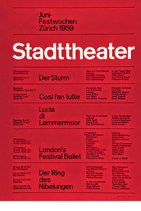
Example of theInternational Typographic style


Here are some important examples of popular grid methods that have been used successful within design for hundreds of years, they form the basis of page layout and provide designers with a number of theories that they can apply to their work to make it aesthetically pleasing. 


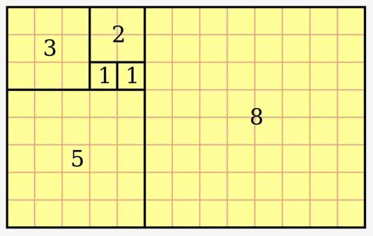
The Fibonacci Sequence 

  1. The Fibonacci sequence is a mathematical pattern that is used in design, in music etc. The pattern works on the basis that each number is the sum of the previous two numbers in the list. The fibonacci sequence works in conjunction with the golden ratio of 6.12. Its principle can be used as a means of achieving balance within design and it is suggested that some of the greatest pieces of art and design throughout history conform to the fibonacci sequence. 

    Fibonacci Sequence


    Fibonacci Sequence applied to art

The Golden Ratio

The Golden Ratio is the common mathematical ratio found in nature that follows a 1.1.61 (1.6) ratio. This is commonly referred to as the Golden Ratio. This ratio is linked to the Fibonacci sequence and provides the bases for a supposed balance and perfect composition within design. 

The Golden Ratio

Canons

Canons are a set of principles used to construct the page proportions, margins and print space of books, documents and page layouts. Throughout history there have been a number of famous canons that have become extremely popular within the field of graphic design. 

The Van de Graaf canon is used in book design to divide a page in pleasing proportions. This canon is also known as the "secret canon" used in many medieval manuscripts and incunabula. The page proportions vary, but most commonly used is the 2:3 proportion. In this canon the text area and page size are of same proportions, and the height of the text area equals the page width.

Van de Graaf's Secret Canon


Tschichold's Golden Canon relies on the 2:3 page ratio to give a type area height equal to page width as demonstrated by a circle, and result in margin proportions 2:3:4:6. The key to the success of the golden canon is the division of the page into nine equal spaces both horizontally and vertically. 

Tscichold's Golden Canon
Golden Canon in use

Experimenting with grids

As primary research I decided to see how different grids can apply to different forms. This allowed me to further understand that grids are everywhere and can be applied to just about anything. I took a portrait of a human face and found that a simple grid can be applied to the construct of the human face to which all the features fit proportionately to this standardised grid that can be applied to any standard human face (see below).

Standardised grid for the Human Face

Friday 24 October 2014

Studio Brief 2 - Interim Critique

OUGD403 - Visual Thinking - Vector Type
Interim Critique 

For this critique we were asked to identify which concept from Alphabet Soup we would be taking forward to produce as a full alphabet for studio brief 2, consider the limitations of producing this digitally, produce a range of letterforms from the chosen concept and to try and apply a grid to these letterforms. 

Due to the simplicity of design 9, It naturaly lends itself well to being digitally reproduced. When asked to consider the restrictions of reproducing this design on illustrator I could not think of any feasible restrictions. Personally I feel the concept will work better when produced in vector form. The straight lines and precise curves will look sharp and exact when produced digitally, producing quality that simply can not be matched. Although hand rendering this design has worked well in the initial stages of development to produce a successful outcome I feel the design will look best in vector form. This was mentioned when gathering feedback,It was suggested it will be effective when reproduced digitally.

Multiple letterforms of my chosen concept

I then looked at applying a grid to my letterforms. I found it extremely usefull earning about grid systems and how they can be applied to just about anything. Trying to apply a grid to my concept I found challenging at first however eventually devised a basic system that my concept adheres to. Although this is not my final grid it is a good start towards designing a successful grid that can apply to any letterform. To test this grid I applied it several letters and it worked successfully however it still requires refinement in order for it to be applied to every letterform. (examples found below)


In order to successfully present this information to my peers I created a small publication articulating the above information so that I did not leave out any information when presenting, I used this as an added support material, which helped me to successfully articulate all the information efficiently. 


I also created a rough concept of what a finished alphabet would look like, this helped me to visualise if the concept would be successful, it was again another extra resource that was extremely helpful when presenting to a group. Students gave me feedback such as 'I really like it' another student reiterated this saying 'I like it, really good', one student said the especially liked the 'E' and 'I' as they were inventive yet still perfectly legible. I was offered constructive criticism in the form of one student suggesting I could look at removing parts of the letterform especially from the fully formed letters such as 'R' 'S' and 'W'. This could add a new layer of meaning to my concept and is worth investigating in the development stages of this brief. It was also suggested that I could use more that one grid for the different styles of letters for example using one grid for similar letters such as 'R' 'P' 'B' and other for more rounded letters such as 'O' 'C' Q' and 'D'. I feel this would work well as it would allow me to simplify each grid and reduce confusion with a vast amount of lines on a grid. 

Thursday 23 October 2014

Studio Brief 2 - Research

OUGD403 - Visual Thinking - Vector Type
Research

When developing my chosen concept into the final design a certain amount of preliminary research was required. As one of the deliverables for this brief was to submit a functioning grid that my typeface adhered too I needed to conduct a range of research into this element as I felt my existing knowledge of the subject was relatively weak. 
I chose to research two figures that are well known in their developmental roles within typography and grid design; Jan Tschichold and Josef Mülller-Brockmann.

Jan Tschichold (1902–1974) was a German typographer who also worked with book design and layout. He was considered revolutionary by members of the design community grid design and compositional work. Author of 3 books; Die neue Typographie (1927), The Proportion of the Book (1955) and The Form of the Book (1937-1975) detail design and typography fundamentals, he had a long and successful carreer. Some may claim the pinnacle of Tschichold's success was his work with Penguin books in which he laid the foundations for their timeless paperback designs. 


Josef Mülller-Brockmann (1914 – 1996) was a Swiss designer that studied architecture and design at the university of Zurich.  He is best known for his use of minimalistic design and simple typography he has inspired a host of subsequent designers especially after the war. He reinforced shared views from Tschichold however added contemporary innovations to elements such as Tschichold's page layout. His extended work with grid systems and layout is  highlighted in his book 'Grid systems in graphic design' this was a key tool that helped  the use of the grid to be implemented into European and American design.


Following this research I looked at my individual concept to see if I could take inspiration and innovate elements used in previous typefaces. When questioning this I received feedback from a peer student saying the concept looked like a letter stencil that I frequently used as a child. This did not appear to me in the development of studio brief 1 however I feel my design is unique enough not to bear particular reference to similar typographic fonts already in existence. 

Stencilling has been known since 8th century China, its predominant purpose within the visual arts is to reproduce designs by applying ink or paint over the holes within the stencil in order for the underlying surface to be decorated. 


Finally I decided to research how to display my final design as it should still look aesthetically pleasing even when not in context. I look at samples from established type foundries such as; Typeface (Switzerland) and Fontsmith (United Kingdom) to see how they applied layout to their typefaces. As well as this I also looked at examples on Pinterest and around our studio and found that commonly the type is laid out in a systematic order from A-Z that often fits within a shape, typically a square or rectangle, to increase the aesthetic of the design. Below includes some example of typography that I find aesthetically pleasing and will consider using a similar layout when assembling my final design. 


Wednesday 22 October 2014

Design Principles - Visual Literacy - Perspective

Design Principles
Visual Literacy - Perspective - 21/10/14

This session we looked at how space can can be used when designing. We moved away from standard 2 dimensional grids and looked at how space can be incorporated into design using 3 dementional techniques to add layers and new meanings to designs. 

I was put into a group of 7 other students and together we were tasked to three dimensionally recreate a single letterform from the 'Lonely Hearts' task last week. The only restrictions were that it had to use a minimum of 4 panels in order to three dimensionally create the letterform. A perfect example of how this type of design has been success in industry is the Channel 4 logo and introductory programme messages. 

In response to this, my group made a collaborative decision to choose the letterform 'Z' from the 'Lonely Hearts' task to reproduce in a three diminutional form. We systematically divided the letterform into sections and produced a viewfinder to work from, this allowed us to all view the piece from the same perspective. We then cut out the individual components of each section taking into account the spacial relationship between each component, this meant that each section needed to be progressively larger as it became further away from the viewfinder in order for the final piece to look of an average proportional size. I made holes in each of the 4 sections and along with another student hung each section from the ceiling using string and the rooms lighting fixtures. This took time and patience to intricately position each component so when viewed through the viewfinder the letterform looked complete. Communication skills were essential for this task and it requires constant and concise verbal communication between myself and the student directing me from the viewfinder. 

When the components were positioned correctly we panted them in a stark red to contrast the white wash walls of the studio, this ensured our letterform stood out and looked effective when viewed through the viewfinder. I am extremely pleased with the outcome I think it looked effective and represented our chosen letterform. I really enjoyed this task as it allowed us to physically make something in an unexpected medium that I had never engaged with before, I also enjoyed the team building side to the task as it allowed me to develop closer relationships to members of my course I have not really engaged with at this point in the programme. (full gallery can be found below)


Final Letterform

Studio Brief 2 - Introduction

Studio Brief 2 - Visual Thinking - Vector Type
Introduction

Brief; 
Produce an alphabet based on one of the letterforms you created from the Alphabet Soup, Visual Thinking brief. You are restricted to working in black, however you may experiment with opacity and half tones.

I think this brief will be exciting as it carries over from studio brief 1, I feel I produced some sophisticated concepts that would work well in order to solve this brief. Working with restrictions will require me to think practically throughout the brief however this will simulate an industry environment. 

Based on critique feedback from studio brief 1 have have decided on my chosen concept I will take forward into studio brief 2. I chose 'Design 9' to develop into a full alphabet because of its minimalistic vibe and effectiveness to communicate my assigned word 'Empty'. Thos design was popular with myself, students and lecturing staff who all praised the design on its ability to communicate its meaning effectively. I will initially produce my alphabet in uppercase however if time restriction allow I will consider a variant in lowercase to give a more holistic feel to my outcome. 

Chosen concept to develop into full alphabet

Monday 20 October 2014

Studio Brief 1 - Final Critique

OUGD401 - Alphabet Soup
Final Critique

For my final critique I prepared a number of design sheets each documenting;

  • The name of the design 'Design 1' etc 
  • The concept behind the design 
  • The final 10x10cm Design 
  • as well as a digital version of what the design may look like in context 
This helped me to present my ideas to the group efficiently and effectively. Specific comments were made about the presentation of my concepts, The lecturer leading the critique said he like how the designs were clearly labelled for extremely easy referencing, He also like the use of the design in context as it allowed the group to see what a potential design would like as a word. He did mention however I could have included a brief research paragraph documenting the research and development of each concept. 

Design 1

Design 2

Design 3

Design 4

Design 5

Design 6

Design 7

Design 8

Design 9

Design 10

I feel the group reacted well to the designs, they were engaged and responded positively when I presented my concepts. Although a little shy at times I received some good quality feedback. Overall the two most popular designs were; Design 7 and Design 9, I feel this is because they are both sleek modern minimal and effectively convey my assigned word 'Empty'. Some of the feedback included one student saying the design is 'simplistic but effective' another student reiterated this saying 'it's simple and conveys the message well'. I was given some constructive criticism that I could remove the crossbar of the 'A'  in Design 9 to create a totally void empty space, although it is too late to alter this concept now I could look at implementing it in Studio Brief 2, which is informed by Studio Brief 1. Finally the lecturer added that it would be easy to adapt digitally with the potentially for a good quality outcome. 

Based on this feedback I have decided to choose Design 9 to be carried forward into Studio Brief 2, this is because the design is modern and minimal, clearly conveys my assigned word as well as keeping to its origins of Futura and it has been popular with myself, students and lecturing staff.