OUGD503 - Studio Brief 1/Individual Practice
Development: Packaging - Lid Colours
Identifying the limitations of colouring the lids with the resources available to me within the college it was concluded that the most effective means of colouring the lids would be to spray paint the colour onto the individual lids as this would create an even professional finish. Research different brands of spray paint found 'Montana 94' to be the most appropriate as the vast range of 174 colours would allow more choice when designing. These colour also came with a pantone and CMYK reference which would enable me to create consistent digital colour when designing collateral etc.
Identifying the limitations of colouring the lids with the resources available to me within the college it was concluded that the most effective means of colouring the lids would be to spray paint the colour onto the individual lids as this would create an even professional finish. Research different brands of spray paint found 'Montana 94' to be the most appropriate as the vast range of 174 colours would allow more choice when designing. These colour also came with a pantone and CMYK reference which would enable me to create consistent digital colour when designing collateral etc.
Identifying the colours that would become symbolic of the different bless was initially difficult as these colours needed to be easily distinguishable from one another yet representative of the blend. Referring back to the tasting notes greatly aided this process as they gave unique details about each blend the helped to associate colours with for example 'red fruit and creamy finish' would connote red/warm colours to be the most appropriate colour association. I then took these tasting notes and the montana colour palette and asked for feedback from a number of participants from different demographics. This experiment involved reading aloud the tasting notes then asking the participant to choose a colour from the montana palette that best represented this description. I found this process to work extremely well as each response was slightly different adding variation to the results.
 |
| 1 |
 |
| 2 |
 |
| 3 |
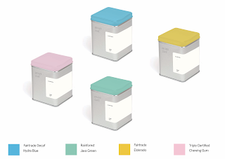
Evaluating these colour palettes found that (1) the red and orange were slightly too similar and would clash against each other as part of the product range, the blue was also too dark which could defeat the purpose of adding an element of vibrate colour to the design, this feels abit dull. The second palette (2) I found far more engaging, the pastel colours added further urban connotations that were bright and playful, this is more the type of colour palette I was looking for as these colours will stand out and catch the users eye. Pure colours such as Cyan or Magenta may look too strong and chemical which would contrast the brands environmental ethos however these pastels work well suggesting softer connotations that will appeal to the audience. I was slightly concerned bout the yellow as this can be difficult to place lighter colours with on collateral for example. Palette (3) was fairly engaging with the teal and red standing out as bold colours that would appeal to the target audience however the teal and green were too similar to be easily distinguished at a glance and similarly to the blue in palette 1 the purple was too dark to provide the eye-catching burst of colour that I was looking for.
Having identified that colour palette 2 was the most successful I then looked further into these colours and found that some of the selections were by chance similar to the certifying bodies. Java Green was chosen for the rainforest blend which is either subliminally or coincidentally very similar to the colour of the rainforest alliance logo. Furthermore the fair-trade blends were coloured as Hydra Blue which is again very similar to the blue used within the fair trade logo and Eldorado for the decaf blend, this is slightly further away from the lime green used within the fair trade logo however there is still considerable resemblance. I considered changing the yellow to a lime green to make it more representative of the fair-trade logo however concluded this would then be too similar to the green already used within this colour palette. Finally for the Triple certified blend which uses three logos there was not a common colour that could be attributed to this however the chewing gum pink works well fitting a consistent aesthetic with the rest of the palette and referencing the tasting notes or creamy red fruits.
This colour palette is successful in create playful bursts of colour within the packaging design that will be easily distinguishable for the catering staff and will appeal to the consumer. The subliminal connotations relating back to the certified charities will draw further relation back to the ethical production of the coffee attributing and strengthening the overall brand concept. With this said I chose this colour palette for my final designs as I feel they are fresh, bold and exciting which will position the brand favourably with the consumer.


No comments:
Post a Comment