OUGD503 - Studio Brief 1/Individual Practice
Development: Packaging - Label Development
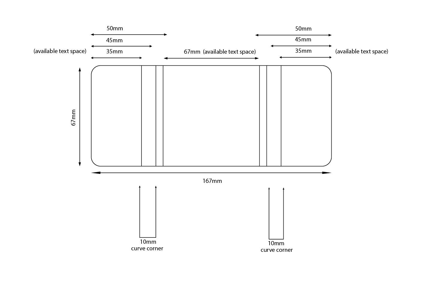
With the Tins ordered for the mock ups arrived the next stage of the development for the label design was to create a scale version ready for production. Firstly measurements were taken from the tin to create an appropriate label size, this was then placed on an illustrator file highlighting the exact measurements of the label. The curved corners caused difficulties with creating appropriate dimensions as this would start to deform the text making the information more difficult to read. In response to this problem I identified appropriate available text space that would ensure all the information does not start to creep around the corners and onto the next side of the tin. This forward thinking will result in a more professional outcome that is fitted perfectly around the packaging material to create a more successful packaging design that will take pride of place on display.


With the Tins ordered for the mock ups arrived the next stage of the development for the label design was to create a scale version ready for production. Firstly measurements were taken from the tin to create an appropriate label size, this was then placed on an illustrator file highlighting the exact measurements of the label. The curved corners caused difficulties with creating appropriate dimensions as this would start to deform the text making the information more difficult to read. In response to this problem I identified appropriate available text space that would ensure all the information does not start to creep around the corners and onto the next side of the tin. This forward thinking will result in a more professional outcome that is fitted perfectly around the packaging material to create a more successful packaging design that will take pride of place on display.


With an accurate scale identified it was then much simpler to input the text onto the design. The blend name and grand cafe logo are positioned on the front as this is the essential information. On the fully wrapped side more detail about the individual blend is positioned including the certifying charity logo to add a sense of legitimacy to the information. Finally on the second half sleeve social media links and the UCC logo are placed to engage a younger audience and excelerate the brands online presence and awareness.

The first label design has a minimalist aesthetic the accentuates the use of raw sustainable materials within the packaging design. The monochrome label will reduce printing costs and allow a singular strong burst of colour to come from the lid which will engage and catch the eye of the consumer. This minimal design will not confuse or overpower the audience making the information appear engaging and concise which highlights the brands tone of voice as direct and information as states within the brand DNA.

Unsure if the first design would look too minimal therefore would be less engaging to consumers I developed a variation of this design that implements a modular grid system to the design. The grid creates a nice aesthetic and the introduction of colour brings subtly brings the label to life. The colours for the grid would be taken from the blends lid colour, which allows continuity between the lid and label within the packaging design. As the Rainforest alliance logo is grey and un-chanageabe due to copywrite I changed the rest o the text to a dark grey which becomes less invasive and complements the pastel pink more however it will need to be identified through feedback if this is more or less effective. The next stage within this design process will be to print these scale labels and mock them up onto physical cans to evaluate which is the most effective and engaging label variation.
No comments:
Post a Comment