Tuesday, 26 January 2016

OUGD503 - YCN - Production: Proof Mock Up Feedback

OUGD503 - Studio Brief 1/Individual Practice 


Production: Proof Mock Up Feedback

The response received towards the proof mock up was very encouraging as all the people asked for feedback commented on the quality of the resolution. When questioned about the sandblasting and if it was appropriate technique every participant questioned said they liked the effect it produced, comments regarding the sandblasting included; I really like how you've utilised the properties of the metal to give it this nice textured effect' and 'I love the lid, I think its so effective and will stand out, I personally think the front logo could be little bit smaller as it feel a tad quashed but thats up to you'. I agreed the grand cafe logo looked rather large on the front however this boldly promotes the brand and will ensure it is rememberable to the consumer. 

There were no advised changed to the label design, the feedback received regarding the label was largely positive for example 'I like the simple design, it goes well with the metal not being too out there' 'the coloured lines make the label much more contemporary, I like the minimal colour palette as its subtle but fun and very effective' More general comments on the packaging as a whole included 'It looks quality, not like the cheap plastic bag that was used before, this gives a real sense of something bit more special' and 'I think the tins a really good idea, its re-useable, protective and looks really cool, good job'. From this feedback I will trial a smaller logo and evaluate if this would be more appropriate before expanding the label designs to the three other blends which would leave me feeling confident to produce the final packaging resolutions. 


OUGD503 - YCN - Production: Proof Mock Up

OUGD503 - Studio Brief 1/Individual Practice 


Production: Proof Mock Up

Due to the expensive nature of this brief, outsourcing all the materials has been expensive therefore the resolution needed exact planning to ensure there are no errors within the production of the packaging. To ensure a successful resolution it was important to create a proof mock up that would be to scale using all the final designs/techniques, this will give the best idea of what the final resolution will look like and allow any final changes before the production of the full grand cafe packaging range. To indent the tin as envisioned was impossible with college resources, the closest to replicating this technique was sandblasting the text onto the aluminium tin. This required specialist sandblast resist vinyl that had to be outsourced from the college. The principle behind this was to cover expose the areas of text to high pressure sand and cover the rest of the surface area to protect it from the blast, this was intricately developed into a vinyl sticker that would align perfectly with the front of the tin for continuity across all the final cans.


Although not the intended intended stamp effect envisioned within the concept the sand blasted lettering was very aesthetically pleasing, with a slight texture and altering the colour of the aluminium to a dark grey this added a great effect to the metal enhancing its overall aesthetic. The lettering didnt have 100% perfect staring lines that would be viewed digitally however this didn't matter and actually elevated the design. The minimal imperfections in the lettering added tactile humanist features to the type that related back to the design decisions behind the logo.


The label was then printed on single side matt adhesive stock which removed any need for separate glues/adhesives. This was further simplified as the vinyl cutter can cut and score this adhesive paper removing any imperfections that would have occurred from cutting the label by hand. This was then applied to the tin to create the final proof mock up. Unfortunately the spray paint did not arrive in time to be included within the proof mock up but I was assured by the technician that the spray painted lid would still work with the sandblasting technique. 

OUGD503 - YCN - Label Feedback

OUGD503 - Studio Brief 1/Individual Practice 


Development: Packaging - Label Feedback

Printing the label variations and placing them onto the tins gave a far better idea of how a finished resolution would look. These mock ups were then shown to a range of students and tutors to help identify which design was most successful and should be developed into the final label design. Students reacted positively to both label designs with comments including 'I really like the shape' and 'I love the half label on the front, it gives a nice balance between the label and metal. When asking which label they felt would be most successful as a final resolution there was mixed opinions as some students liked the minimal monochrome nature of the first label however students felt the coloured grid was more engaging and fun adding simple colour to the label created continuity with the lid bring the elements of the design together as one.


1


2

Deciding that the 2nd variation was more appropriate and engaging there were a few minor changed suggested by tutors including 'I like the colour and think it works well, id say use the black text though instead of grey, it just makes it stand out bit more' Agreeing with these comments the suggested changes were made to create the final label design. This design is engaging yet minimal with the half sleeve accentuating the raw materials of the tin, the wrap applying a good proportion of text space and the elements of colour add an engaging aesthetic to the label that ties it to the lid concept which will work well for the packaging  design as a whole.

Final Label Design

Monday, 25 January 2016

OUGD503 Collaborative Practice - Creative Partner

OUGD503 - Studio Brief 2/Collaborative Practice 


Creative Partner 

Following the Pitcha Kucha presentations we were indeed into the student cafe where each brief had been placed on a different table for students to congregate around the brief they had a particular focus for. I went to the GAP brief table however no-one initially came which was disheartening as I felt the brief would evoke a really engaging body of work as a result. I began to consider other alternatives when I began taking to an illustration student, looking at their work I felt potentially for a collaboration and with a little bit of persuading he agreed to collaborate on the GAP brief with me. He said he hadn't initially looked at it although felt their was opportunity to develop a good response with a mix of illustration and graphic design. 

I chose to work with an illustration student called Billy, he has a confident style and I appreciate his work, he is experimental when it comes to medium which I like and I feel our individual styles could complement one another. I am happy working in a group of two as I feel this will be the most productive as billy can focus on the illustrative elements of the response, which I am unable to specialise in and I can focus on the concept and communication to the target audience. With this established we agreed to meet in the near future to build some solid ideas. In the meant time we set objectives to look at the brief in detail and for billy to start drawing some illustrations in a few different styles so that we could find an aesthetic that we felt would suit the tone of voice for the brief and its audience. 


Small Examples of Billy's work

OUGD503 Collaborative Practice - Pitcha Kucha

OUGD503 - Studio Brief 2/Collaborative Practice 


Pitcha Kucha

To find creative partner for collaborative practice Pitcha Kucha was briefed as a means to link up with other students from different courses. All students were required to create a 3 slide presentation documenting pieces of their own work, professional work they admired and briefs they most wanted to work on from the YCN and D&AD selection. I identified an illustration student to work with as my drawing skills are not nearly refined enough to feel confident in responding to a brief with them however I do like illustrative work that is playful and unique. I identified GAP as my first choice brief as I think illustration could link up particularly well with this to create an engaging and fun social media campaign. Supporting briefs were the sustainable fish campaign from YCN and the D&AD desperados brief as I felt there was potential to explore an illustrative style within these projects. 

The presentations themselves were really engaging and interest, I was a great insight into the talent within the college and showed what different projects other courses had been working on which is something I never get to see. I identified a number of illustration students with styles I particularly liked and felt wold complement my individual style to create a really engaging project. 


OUGD503 - YCN - Development: Packaging - Label Development

OUGD503 - Studio Brief 1/Individual Practice 


Development: Packaging - Label Development

With the Tins ordered for the mock ups arrived the next stage of the development for the label design was to create a scale version ready for production.  Firstly measurements were taken from the tin to create an appropriate label size, this was then placed on an illustrator file highlighting the exact measurements of the label. The curved corners caused difficulties with creating appropriate dimensions as this would start to deform the text making the information more difficult to read. In response to this problem I identified appropriate available text space that would ensure all the information does not start to creep around the corners and onto the next side of the tin. This forward thinking will result in a more professional outcome that is fitted perfectly around the packaging material to create a more successful packaging design that will take pride of place on display. 


With an accurate scale identified it was then much simpler to input the text onto the design. The blend name and grand cafe logo are positioned on the front as this is the essential information. On the fully wrapped side more detail about the individual blend is positioned including the certifying charity logo to add a sense of legitimacy to the information. Finally on the second half sleeve social media links and the UCC logo are placed to engage a younger audience and excelerate the brands online presence and awareness. 


The first label design has a minimalist aesthetic the accentuates the use of raw sustainable materials within the packaging design. The monochrome label will reduce printing costs and allow a singular strong burst of colour to come from the lid which will engage and catch the eye of the consumer. This minimal design will not confuse or overpower the audience making the information appear engaging and concise which highlights the brands tone of voice as direct and information as states within the brand DNA. 


Unsure if the first design would look too minimal therefore would be less engaging to consumers I developed a variation of this design that implements a modular grid system to the design. The grid creates a nice aesthetic and the introduction of colour brings subtly brings the label to life. The colours for the grid would be taken from the blends lid colour, which allows continuity between the lid and label within the packaging design. As the Rainforest alliance logo is grey and un-chanageabe due to copywrite I changed the rest o the text to a dark grey which becomes less invasive and complements the pastel pink more however it will need to be identified through feedback if this is more or less effective. The next stage within this design process will be to print these scale labels and mock them up onto physical cans to evaluate which is the most effective and engaging label variation.  

OUGD503 - YCN - Development: Packaging - Lid Colours

OUGD503 - Studio Brief 1/Individual Practice 


Development: Packaging - Lid Colours 

Identifying the limitations of colouring the lids with the resources available to me within the college it was concluded that the most effective means of colouring the lids would be to spray paint the colour onto the individual lids as this would create an even professional finish. Research different brands of spray paint found 'Montana 94' to be the most appropriate as the vast range of 174 colours would allow more choice when designing. These colour also came with a pantone and CMYK reference which would enable me to create consistent digital colour when designing collateral etc. 


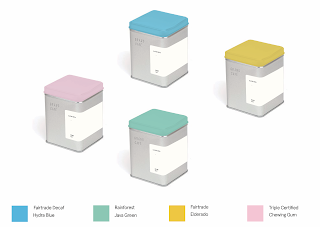
Identifying the colours that would become symbolic of the different bless was initially difficult as these colours needed to be easily distinguishable from one another yet representative of the blend. Referring back to the tasting notes greatly aided this process as they gave unique details about each blend the helped to associate colours with for example 'red fruit and creamy finish' would connote red/warm colours to be the most appropriate colour association. I then took these tasting notes and the montana colour palette and asked for feedback from a number of participants from different demographics. This experiment involved reading aloud the tasting notes then asking the participant to choose a colour from the montana palette that best represented this description. I found this process to work extremely well as each response was slightly different adding variation to the results. 


1
2

3

Evaluating these colour palettes found that (1) the red and orange were slightly too similar and would clash against each other as part of the product range, the blue was also too dark which could defeat the purpose of adding an element of vibrate colour to the design, this feels abit dull. The second palette (2) I found far more engaging, the pastel colours added further urban connotations that were bright and playful, this is more the type of colour palette I was looking for as these colours will stand out and catch the users eye. Pure colours such as Cyan or Magenta may look too strong and chemical which would contrast the brands environmental ethos however these pastels work well suggesting softer connotations that will appeal to the audience. I was slightly concerned bout the yellow as this can be difficult to place lighter colours with on collateral for example. Palette (3) was fairly engaging with the teal and red standing out as bold colours that would appeal to the target audience however the teal and green were too similar to be easily distinguished at a glance and  similarly to the blue in palette 1 the purple was too dark to provide the eye-catching burst of colour that I was looking for. 


Having identified that colour palette 2 was the most successful I then looked further into these colours and found that some of the selections were by chance similar to the certifying bodies. Java Green was chosen for the rainforest blend which is either subliminally or coincidentally very similar to the colour of the rainforest alliance logo. Furthermore the fair-trade blends were coloured as Hydra Blue which is again very similar to the blue used within the fair trade logo and Eldorado for the decaf blend, this is slightly further away from the lime green used within the fair trade logo however there is still considerable resemblance. I considered changing the yellow to a lime green to make it more representative of the fair-trade logo however concluded this would then be too similar to the green already used within this colour palette. Finally for the Triple certified blend which uses three logos there was not a common colour that could be attributed to this however the chewing gum pink works well fitting a consistent aesthetic with the rest of the palette and referencing the tasting notes or creamy red fruits. 

This colour palette is successful in create playful bursts of colour within the packaging design that will be easily distinguishable for the catering staff and will appeal to the consumer. The subliminal connotations relating back to the certified charities will draw further relation back to the ethical production of the coffee attributing and strengthening the overall brand concept. With this said I chose this colour palette for my final designs as I feel they are fresh, bold and exciting which will position the brand favourably with the consumer.

OUGD503 - YCN - Development: Packaging - Mock up

OUGD503 - Studio Brief 1/Individual Practice 


Initial Ideas: Packaging - Mock up

With a label shape defined, the most appropriate way to mock this up in order to demonstrate what a resolution may look like would be digitally as this allows for natural progression and development with the ability to change and play around with different aspects of the design. To further accentuate the raw material used a debossed logo design will be placed into the aluminium tin. This will add a tactile dimension to the packaging that will engage the audience to physically interact with the product. It also further pushes the brands identity as if the tin is recycled/up-cycled the label can be removed but the brands identity will always be present on the tin. Looking at production methods of the decoding found it can be sandblasted with the resources at university however if produced in industry would most likely be debased with a custom steel stamp however this is not available to be within the college. 


Functionality was just as important as aesthetic within my packaging concept. The creative implementations of coloured lids would aid the barista/ catering staff as they can easily identify the different blends based on colour as opposed to having to look at each individual label. This will be especially beneficial within the products busy environment and will add bold iconic colour to the packing making it more eye-catching and engaging to the consumer.


The side of the tin that is fully wrapped by the label has been used to communicate more detailed information about the individual blend. This describes the benefits of choosing sustainable coffee and the good it will do for the environment and plantation workers. Using the charity logos above the text adds legitimacy to the brand and connotes further sustainable connotations as these charities are closely associated to the environment.


The label design is minimal using plenty of white space, this allows the elements of the design to breath and not feel too compressed. The minimal aesthetic compliments the raw material with the monotone label adding contemporary connotations which allows the lid to provide a sharp burst of colour to grab the eye and engage the audience, this is also functional to aid the catering staff and make the blends easier to identify. This mock is engaging aesthetically pleasing therefore will be developed further into a physical label. 

Sunday, 24 January 2016

OUGD503 - YCN - Development: Packaging - Label Experimentation

OUGD503 - Studio Brief 1/Individual Practice 


Development: Packaging - Label Experimentation

With an aluminium tin identified as a innovative packaging material that would aesthetically engage the consumer and fits the sustainable ethos of the brand the next stage of the packaging development was to create a label/graphic that would add the critical information and branding to the packaging. This would be a major challenge as on the existing packaging the whole surface area was available for text whereas with the tin the label would be the only available printing surface. Researching tin packaging companies offer bespoke tin printing services that print directly onto the aluminium body however this would greatly increase production cost what would be unfeasible for the products budget. 

I experimented with a range of labels to find the most appropriate aesthetically and physically to that would allow the required information to be communicated to the audience in as aesthetic style as possible. This first design was based on sleek minimalist inspiration. The long thin label accentuates the shape of the tin however post production analysis of this label revealed several flaws such as there was limited space for text, this text would be difficult to read at a decent point size only being able to fit 4 words max per line making it confusing and un-engaging to the reader. A further problem identified was the the label would have to be broken to open the tin, whist ensuring that the product cannot be opened until purchased (or being evident that it had) this tear would form an unaesthetic feature against the clean lines of the tin. 


1

This label focused on a standard 'belly band' concept heavily used within packaging and publication design. Whilst resolving some of the issues deprived from the first experiment (1) this label felt bit standard and didn't provide the 'wow factor' identified in the brief. This design has plenty of space for copy/graphics however covers up a large proportion of the aluminium tin which is a striking feature of the product and would be most effectively left exposed as a design feature that will engage the audience. 

2

The final experiment is a variation of the belly band covering half of the front, leaving plenty of the raw material exposed however providing space on the font of the packing for branding/ essential info. This then wraps round highlighting the curves of the tin to a full side of label that can be used for more detailed information such as that of the unique blend as found on the existing packaging. Finally this wraps round further to a second half sleeve on the third side creating a nice symmetrical label that leaved half of the third side and the whole of the 4th exposed accentuating the raw sustainable material. The half sleeves on the front and back of the tin add contemporary styling to the label that will engage the audience and still leaves an good proportion of the original material exposed that represents the sustainable material that relates back to the brands strong environmental ethos. 

3


FEEDBACK:

Following this experimentation feedback was acquired from students regarding the suitability of each label experiment. The conclusion of such research was in accordance to my own findings that the third variant (3) was the most suitable label that should be developed further. Comments from students included 'the third design is most appropriate as the first is too thin for text, the second is too chunky and the third is probably about right (like goldilocks really)' and 'I think the third design works really well and will compliment your logo, both have contemporary styling that will appeal to a young/urban audience. I really like how this leaves a lot of the material exposed as its a strong feature of the design'. From this experimentation/feedback the third concept can be developed further adding text/image and branding to create a sophisticated label mock up. 

OUGD503 - YCN - Initial Ideas: Packaging Concept

OUGD503 - Studio Brief 1/Individual Practice 


Initial Ideas: Packaging Concept

With an exciting new identity for the brand, that appeals a contemporary customer and highlights the brands sustainable ethos. The next stage in fully resolving the brief was to discover a way to fully revitalise the brand. Reading bad through the brief a key statement that stood out was that UCC wants to give Grand Cafe the 'WOW factor' and that the current design 'doesn't bring the brand to life'. This drew back to the brands current packaging as it doesn't effectively engage its customers and is admitted by the client to often 'hide within a cupboard underneath the counter' they want the brand to take 'pride of place on display' this identified an need for a new packaging design that will engage the customers using a strong aesthetic that truly transforms the brand into a new dimension. 


Analysing the existing packaging designs lead to the conclusion that not only should the design of the packaging be revitalised but the materials themselves. Currently the packaging is made of plastic that is non-biodegradable and cannot be recycled or disposed of as responsibly as other materials. This felt to directly contrast the brands ethos and environmental production values lowering the brands integrity preaching ethical harvesting of the beans but packaging them in materials that harm the environment they aim to protect. Reusable and sustainable materials are frequently used within coffee packaging, the most notable being of the Douwe Egberts coffee packaged in glass jars, that have been seen to produce endless up cycling projects. This USP makes the coffee more desirable due to the glass jar being recycled countless ways by its customers. 


Focusing the packaging designs on more environmentally friendly materials will increase the brands legitimacy, make the product more attractive aesthetically, using high quality materials that look more established that plastic bags and ensure the focus of ethical production flows through the brands DNA. From the humanist qualities of the logo to the informed material selection used within the packing this will realise the brand as experienced and knowledgeable promoting the ethical production and delivery of their product that will be engaging to consumers and reinforces the brands ethos as committed to sustainability. 


This case study lead to a research into sustainable materials and packaging with a focus on recyclable/re-purposable materials based on the success of the Douwe Egberts jar. This research concluded Aluminium Tin would be a viable packaging option due to its sustainable qualities. Aluminium's ability to form any shape and its protective qualities have made it the most versatile packaging material in the world. Key benefits include is sustainability as aluminium foil, aluminium cans and other aluminium packaging materials can be fully recycled and reused an infinite number of times. 


Concluding aluminium was a viable material selection inline with the brands sustainable ethos, I then looked at different forms of aluminium packaging. From this I found that Aluminium tins held the most promising concept to be developed into a successful packaging solution. The structure meant it could hold the coffee securely adding a solid water barrier and withholding the natural aroma of the beans. Further more the tin will look more substantial to display than a plastic pouch which adds further incentive to display the product on the counter. Using the exposed raw material adds an tactile nature to the packaging which will engage the user, and being the abundant metal in the Earth's crust relates the material selection back to the environmental aesthetic that I am embedding into the brands DNA creating consistency with the branding concept. 

Through further research it was identified that square tins would be more environmentally friendly than circle tins  in terms of shipping. Square tins stack neatly with no wasted space wheres circle tins leave high proportions of wasted space that will increase air miles adding to global pollution required for transporting the product.  This wasted space will result in more vans needed to ship the product due to the accumulated amount of wasted space as a result on uninformed design decisions. This further defines the brand and ever conscious of the environment and demonstrates how Grand Cafe shows serious commitment to the sustainability and ethics of its product from every possible angle. 
Square vs Circle tins highlighting wasted space in yellow

To enhance the functionality of the packaging within its environment it would be a creative idea to assign each blend a different colour and place this on the lid therefore the blends can be easily distinguished by the barista which will be beneficial in a busy cafe/restaurant environment. This would allow the catering staff to become quickly familiar with the blends associating each one with a colour that will provide better recall and more efficient delivery of the coffee to the customer as they can quickly grab the correct colour dependant on which blend the customer requests. 

This packing concept is extensively researched and thought out to embed the brands USP into every aspect of the product. These refined proposal reinforces the brands ethos the DNA of the product, from the logo design using humanist features to represent the ethical production values of the product, to the sustainable materials used within its packaging design and its educated awareness distribution informing the shape of the packaging design. Based on this concept I ordered a sample tin to experiment with and form the basis of the packaging concept, from this dimensions for the labels, graphics can be experiment with on a live scale and be developed accordingly.


Friday, 22 January 2016

OUGD503 - YCN - Development: Logo - Further Development/Final Design

OUGD503 - Studio Brief 1/Individual Practice 


Development: Logo - Further Development

With a strong logo concept identified the next stage of the design process was to experiment further developing more intricate components of the logo to ensure the most appropriate resolution is reached. Based on tutor feedback the first area of development was choosing experimenting with different typefaces as it was suggested a thicker weight may be more effective in standing out to an audience. I trained three variant typefaces Langdon (top) GT Pressura (middle) and DIN (bottom) liquifying each one individually to create unique manipulations. Reviewing these variants the GT Pressura manipulation stood out from the rest, the thicker weight have it more presence demonstrating how it would stand out as an  bold, iconic logo. Asking a range of participants which variant they preferred 63% said they liked the middle one (GT Pressura) Followed by 27% voting DIN. Comments contextualising this decision included 'it stands out the most' and 'theres good spacing making it proportionate and professional'.


Using the liquify tool in photoshop allows a uniquely crafted aesthetic to be produced, this eliminates the digital rigidity that can come from many typefaces. Subtle manipulations to each letterform add humanist features to the logotype that adds a sense of personality to the logo. This effect fits well within the brands ethos of sustainability and the environment as the letterforms look more natural and imperfect representing the organic nature of the brand. Whereas the original typeface could be seen to represent a mass produced product that that focuses of uniformity, This logo allows the brand to articulate its ethical production values that adds a sense of human interaction as opposed to a fixed typeface that has a very mechanical aesthetic and connotations.

To focus more on this sense of human interaction and adding personality to the brand, I took the original typeface, printed it and physically traced around the letterforms which created a hand rendered aesthetic, this was aimed at reducing the digital production of the logo all together as this could replace the liquify option. However when scanned in and vectorised the hand rendered logo showed too many imperfections to be effective, this hand rendered variant looked shabby and didn't connote professionalism whereas the liquified design strategy looked high quality and contemporary, this suggesting humanist features within the logo without detracting from its professional connotations. 


The final logo uses GT Pressura with custom tracking and adjusted leading to create a unique logotype that has a strong professional aesthetic. The typeface is then liquified in photoshop to remove a sense of digital rigidity from the logotype. This adds subtle humanist detailing that give the logo and brand identity a stronger sense of personality and adheres the the prescribed tone of voice of the brand. This promotes organic connotations that will appeal to the brands personality and highlight their environmental production values and ethical ethos. 

Due to the designs monotone colour palette it will fit in nicely to a range of environments with opportunity to add bold colourful detailing within the packaging design to really bring the brand to life. The contemporary aesthetic will allow the product to reach new audiences such as urban cafes and boutiques whilst remaining loyal to existing customers articulating its ethical ethos within the branding concept. 

Final Logo Design

OUGD503 - YCN - Development: Logo - Feedback

OUGD503 - Studio Brief 1/Individual Practice 


Development: Logo - Feedback 


To evaluate the concepts created for the logo designs, it was essential to obtain feedback from students and tutors as they have critical design insight and can be attributed to the target audience being part of the general public. This feedback started by showing participants the previous blog post that highlights a succinct explanation behind each of the digital renders to articulate the concept behind each design (Found Here), They were then invited to share opinions regarding their favourite concepts and which designs they felt would make the most appropriate logo for the new identity if Grand Cafe. 

There was positive reaction from students towards designs 1 and 6 as they felt the thick weights stood out and would create bold, iconic logotype. Comments included 'I think these two look contemporary and would be really versatile over all the different things you put the logo on' however some of the students felt these designs felt 'too digital' for the brand, who promote the environment suggesting these concepts felt a little too 'corporate' to represent the brands true identity. 

There was mixed feedback for the 2nd design as some students liked the playful arrangement of the letterforms saying 'it makes it more fun and gives the brand bit of personality' although other students felt it wasn't as successful as some of the other designs saying 'it looks bit childish like fridge magnet letters, this might confuse who your audience actually is' 

Concept 3 was praised for its minimal aesthetic however issues arose regarding its legibility. Due to its minimalist design it was identified that 'the type doesn't pop or stand out which is what you really need from a logo' a student said 'a logo needs to be rememberable, and while this looks really nice it won't stand out' 

The abbreviation used within concept 4 was highly praised for being 'inventive' and could be used in isolation or anchored with the supporting text however students felt the serif typeface was inappropriate for the tone of the brand. This was highlighted in comments such as 'I like the whole abbreviation thing, but the serif makes it look far too fancy for the brand' and 'I think the serifs confuse the brands message, this might put off some customers as well thinking it might be too posh for them or might be out of their price range based purely on the aesthetic. 

Finally the 5th design was said to be the most appropriate by several students, they gave comments including 'this looks like it should be in a trendy urban cafe' and 'I love how you've got rid of the digital feel that was too obvious in other designs with the subtle little deformities in the letters' the most notable being 'I think this represents the band the most appropriately out of all these designs'


Tutor Feedback: 
Asking tutors for feedback regarding the logo designs would further establish which concept is the most appropriate to realise the brand. I explained the concepts of the different designs to a number of tutors and also showed them the brand DNA which highlighted the brand personality and tone of voice. Tutors suggested that the 5th concept was the most appropriate as it feels friendly and accessible, is representative of the brands ethical values and will due to its modified letterforms can become iconic of the brand. 

Extract from brand DNA

Further tutor feedback suggested trailing a range of typefaces particularly the one used in concept 6 as this thicker weight would make the logo stand out further and create a sense of authority. This is something that can be further developed to ensure the final logo concept will create a greater sense of brand awareness that will appeal to the audience more so than the brands current identity. 

Thursday, 21 January 2016

OUGD503 - YCN - Development: Logo - Digital Renders

OUGD503 - Studio Brief 1/Individual Practice 


Development: Logo - Digital Renders

With paper sketches complete, I reviewed the designs and picked the sketched that showed elements of a strong concept that could be extended across the brands identity and aesthetics that would be popular with the target audience. These Selections were still varied in terms of their concepts and aesthetic styles, below highlights a succinct summary explaining the design decisions and concepts behind each of these digital renders. 


This concept was developed from a standard flat text however this looked too 'digital' and corporate, the slight arc in which with type is set adds slightly more relaxed connotations that is more engaging that flat text. If developed this could be paired with a distinct icon to create a strong sense of identity to the brand or reversely could be used as strong independent logotype that due to its simplicity would be extremely replicable over a range of collateral. 


Developed to represent connotations of the environment, this concept has a range of polysemic interpretations. It represents the landscape of the origins of the beans, these hilly plantations can be identified within the erratic positioning of the letterforms. This irregular structuring of the text suggest a more humanist approach to digital design with each letter being positioned as opposed to standard defeat settings. The thick weight of the typeface ensures this concept would stand out and adds a sense of playfulness to the type which will appeal to the target audience, representing the personality of the brand. 


A brand should look the part in order to succeed. This concept is based on the principal of legitimacy, The large serif abbreviation connotes quality and luxury, supported by the full name underneath to ensure the brand name it visible to the consumer. This logo design is well established and provides the user with connotations of success and brand legitimacy, this will aid the adoption rate of the re-design as it will suggest luxury and that it is well-established, which would persuade consumers to purchase the product. 

This concept is very contemporary in its design and uses subtle hints to suggest the brands ethical values though the use of liquifying the text to add humanist features to the design. This suggests an almost hand rendered aesthetic that adds a sense of personality to the brand. The deformed letterforms could connote a recycled aesthetic that fits the brands ethos well, these subtle alterations to the typeface ensure the brand will be unique and stand out to its consumers. This is a good way to build a strong brand identity as the manipulated letterforms can be extended across the collateral and will become iconic of the Grand Cafe brand. 


The custom tracking of the text allows the custom letterforms to create a strong visual aesthetic for the brand. This aesthetic resembles a stamp could connote a reusable aesthetic similar to that used within other coffee brands that were identified as part of research. The large circle would be developed into a custom icon for the brand if developed further however feedback would be needed to identify appropriate icons that could become symbolic of the brand. The slogan 'purveyors of certified coffee' has been adopted into the concept to suggest a higher brand legitimacy and state the USP of the product within the logo. 

With the digital renders finished to a good standard the next stage within the design process is to acquire feedback from a range of students and tutors as to which they feel is the most appropriate to the brand, This will identify which concept/concepts to develop further into sophisticated design directions that will result in the most appropriate response to the brief.